Hello!
I am wanting to make the Shopify main menu so that the cart icon is on the same line as the logo and menu items. Additionally, how would I apply a slight drop shadow below the menu bar? Similar to the second screenshot attached. I’m trying to make the menu on Shopify look identical to an HTML/CSS based site as in the second photo. Thank you for any help!
1、Edit theme.
2、Add the following content to “Custom CSS”:
“. header wrapper – border bottom{
Box shadow: 0px 3px 5px rgba (0, 0, 0, 0.4);
}”
Hi @chriscaldwell11
Can you kindly share your store link (with the password, if any) with us? We will check it and suggest you a solution if possible.
Hello,
The pw is **QuincyJones11!!
It’s coming along, getting closer (thank you Kyle) and looks fine in Chrome/Edge, but not yet in Safari. Also the media queries need work, too as the headings are too large on my phone
Thanks for any and all help!
Please! Can you give me your store link
I see you fixed point the cart icon is on the same line as the logo and menu items
I’ll edit a slight drop shadow below the menu bar for you
You can try this code by following these steps:
Step 1: Go to Shopify Admin → Online Store ->Theme → Edit code
Step 2: Search file base.css or theme.css
Step 3: Insert the below code at the bottom of the file → Save
sticky-header.header-wrapper.color-scheme-1.gradient.header-wrapper--border-bottom {
    box-shadow: 0px 5px 5px rgba(0, 0, 0, 0.2) !important;
}
Final Result:
Hope this help!
1 Like
Thank you so much for this help, the shadow works perfectly.
Now the challenge is to get the menu alignment in Shopify: https://floatron.myshopify.com/ to look like my home site located here: https://chriscaldwell.com/Floatron-3/index.html
The menus display different alignments. I want them to look like the same and It should work in Safari browser, too. The attached screenshots are from Safari on Mac. The menu alignment on Shopify is way off. Not sure where to fix this. Thank you
You can insert the code below to file css
nav.header__inline-menu {
   right: 0;
   transform: translateX(-142px);
}
Final Result:
1 Like
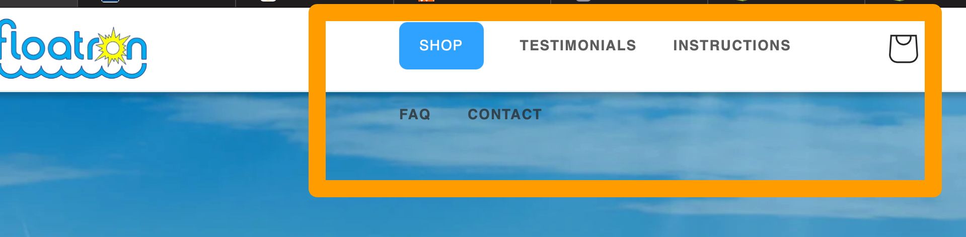
Thanks so much. I have just a couple more questions. When I begin to shrink the browser window, I need to change the break point or something so the menu doesn’t do this weird stacking. Not sure how to figure the break point and what media query to use?
You can see what’s happening in the screenshot. Is there a way to prevent this?
Insert the below code to your file css:
.header__inline-menu .list-menu--inline {
  flex-wrap: nowrap !important;
}
Final Result:
1 Like
This worked PERFECTLY. I’m so appreciative for your help! It’s fun to see it working properly.
Thank you!
1 Like