Hi everyone,
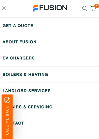
We have a very simple menu on our site which is working as we would like on Desktop, however on the mobile version the background is transparent and makes it impossible to use.
We are using the Habitat theme.
I’m sure I’m missing something fairly simple, if you could give me any guidance, it would be much appreciated.
Thank you
Hi @hi_there_hi
Could you share your store link?
zaczee
October 13, 2023, 8:28am
3
Hi,
Can you share your store url.
Hi @hi_there_hi
Please add this css code to your bottom base.css file in Online store > Themes > Edit codes
.mobile-menu-drawer { background: #fff !important; }
Sorry to be a bit dim but where would bottom base be? I’ve gone to where you’ve directed me (and thanks!) but a bit overwhelmed with the options.
Hi @hi_there_hi ,
This is Anthony from Beae Landing Page Builder, and I’m happy to assist you today.
While I acknowledge that this issue falls short of the desired outcome, I have an idea that I believe might be of help:
Go to Online Store → Theme → Edit code
Open your theme.liquid file
Paste below code before
Best regards,
Anthony
Go to your Online store > Themes > Edit code > find base.css file, go to bottom of file and add the code
Hi @hi_there_hi
This is Henry from PageFly - Landing Page Builder App
You can try this code by following these steps:
Step 1: Go to Online Store->Theme->Edit code.
Step 2: Search file app.css
Step 3: Paste the below code at bottom of the file → Save
.mobile-menu-content {
background: white !important;
}
Hope that my solution works for you.
Best regards,
Henry | PageFly
Thank you so much! This worked perfectly.
I really, really appreciate your time and help!
1 Like
You are welcome @hi_there_hi