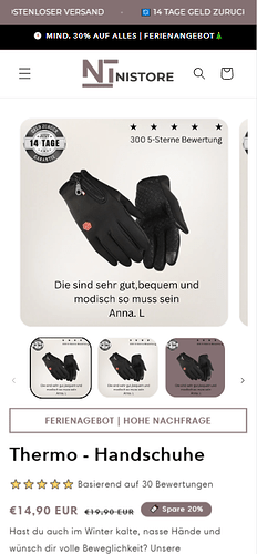
Hello guys, how can I minimize the space here (only in mobile version) desktop version seems to look good.
Topic summary
A user encountered excessive spacing on their Shopify product page, specifically on mobile devices, while the desktop version displayed correctly.
Solutions Provided:
Two community members offered CSS-based fixes:
-
DaisyVo’s approach: Navigate to Shopify admin → Online Store → Customize → Theme Settings → Custom CSS, then add media query code targeting
ul.product__media-listwith negative margins (margin-bottom: -20pxandmargin-top: -40px) for screens under 768px width. -
Moeed’s approach: Edit the
theme.liquidfile directly by adding custom<style>tags with similar mobile-specific CSS above the closing</body>tag.
Both solutions use @media screen and (max-width: 768px) to apply spacing adjustments exclusively to mobile viewports.
Resolution: The user confirmed DaisyVo’s solution successfully resolved the spacing issue.
Hi @NikosBat
I hope you are well. You can follow our instructions below:
Step 1: Shopify admin > Online store > Customize: https://prnt.sc/XQ6IDB99kUCd
Step 2: From the left menu > Theme settings > Open Custom CSS: https://prnt.sc/iDxwa8zBQ4Z-
Step 3: Copy the code below and paste it there
Here is the code for Step 3:
@media screen and (max-width: 768px){
ul.product__media-list {
    margin-bottom: -20px !important;
    margin-top: -40px !important;
}
}
Please let me know if it works. Thank you!
Best,
Daisy - Avada Support Team.
Hey @NikosBat
Follow these Steps:
-
Go to Online Store
-
Edit Code
-
Find theme.liquid file
-
Add the following code in the bottom of the file above tag
RESULT:
If I managed to help you then, don’t forget to Like it and Mark it as Solution!
Best Regards,
Moeed
Thank you very much DaisyVo that solved my problem


