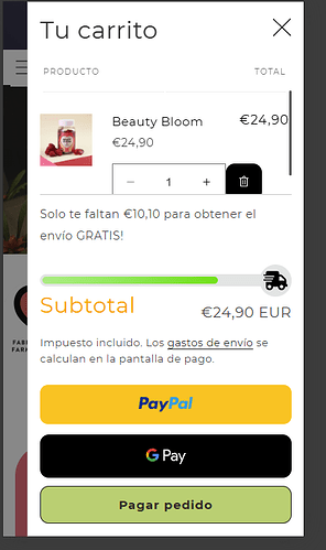
Hey guys,
I’m trying to make the dynamic checkout buttons to be smaller and side by side for mobile.
Currently they look like this on mobile
I’d like for it to look like this (note this image is a photoshop)
I’ve tried doing this to the CSS, but I am unable to put the buttons side by side.
@media screen and (max-width: 767px) {
    .wallet-cart-grid {
        display: flex;
        flex-direction: row !important;

  }
     .wallet-cart-button-container, .wallet-cart-button {
     flex-shrink: 1 !important;

  }

     .wallet-cart-wrapper{
     --wallet-button-width-vertical: 99% !important;
  }

}
@media screen and (min-width: 750px) {
    .cart__ctas {
        display: flex;
        flex-direction: column !important;
        gap: 1rem;
    }
 .wallet-cart-wrapper{
   --wallet-grid-margin-horizontal: 0 24px -2px -5px !important;

}
 .dynamic-checkout__content {
        display: block !important;

    }
  #CartDrawer-Checkout {
         max-width: 100% !important;
    }

}
Can anyone help please?
Thanks a lot!

