A user is trying to implement different background images for mobile and desktop views by adding custom CSS code to their base.css file. They’ve shared a code snippet (shown in an attached image) but it’s not working as intended.
Their goals:
Display a different background image on mobile devices
Scale the mobile background image to fit properly
Current status:
The implementation isn’t functioning correctly
They’re seeking advice on what modifications are needed to their CSS code
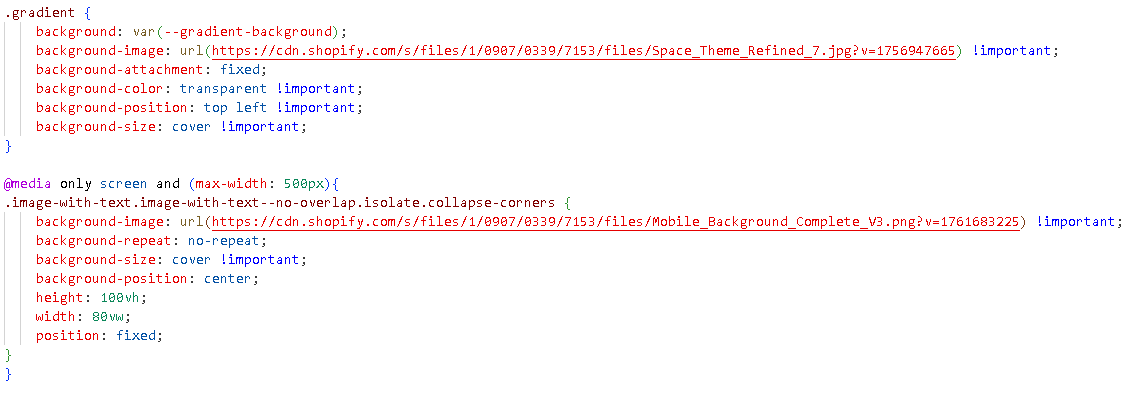
I am attempting to use a different image for my mobile background, and I was wondering what I am doing wrong. In the bottom of the base.css file, I have added the custom code below.
What I am intending to do is use a different image for mobile and also scale it to fit the store background for mobile. Is there any tweaks to the code I can make to accomplish this? My store is Laugh Labs Design, url: laughlabsdesign.com
At the moment you have this code, which does not work. So the question is on what element you want to set this background – on body or on image-with-text?
@media only screen and (max-width: 500px){
  .image-with-text.image-with-text--no-overlap.isolate.collapse-corners {
     body {
       background-image: url(/cdn/shop/files/Mobile_Background_Complete_V3.png?v=1761683225) !important;
       background-repeat: no-repeat;
       background-size: cover !important;
       background-position: center;
       height: 100vh;
       width: 80vw;
       position: fixed;
    }
  }
}
I didn’t respond yesterday for some reason, sorry about that. Currently, I am trying to get the mobile image to show over the entire background. I have two problems at the moment …
The desktop image shows on mobile when I want the mobile image background to show up.
I am unclear which solution is the better one (image with text or using “body”). I tried both variables, neither of which worked on there own.