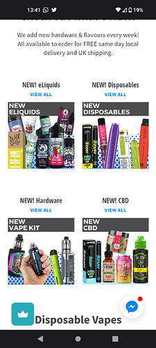
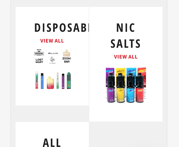
Needed to put two columns to show featured collections on mobile home page so I put this code:
@media screen and (max-width: 749px){
#collection-list-grid .grid__item{
width:50%;
}
It did work but the images are now distorted. I converted the featured collection images to the same aspect ratio and resolution but it still looks the same. I’ve noticed an online site has managed to fix this issue as they also use
the venture theme. Is there any way I can replicate them?
Left image is their store, right is mine. Their URL: royalvapes.co.uk . My URL: vapedepot.co.uk

