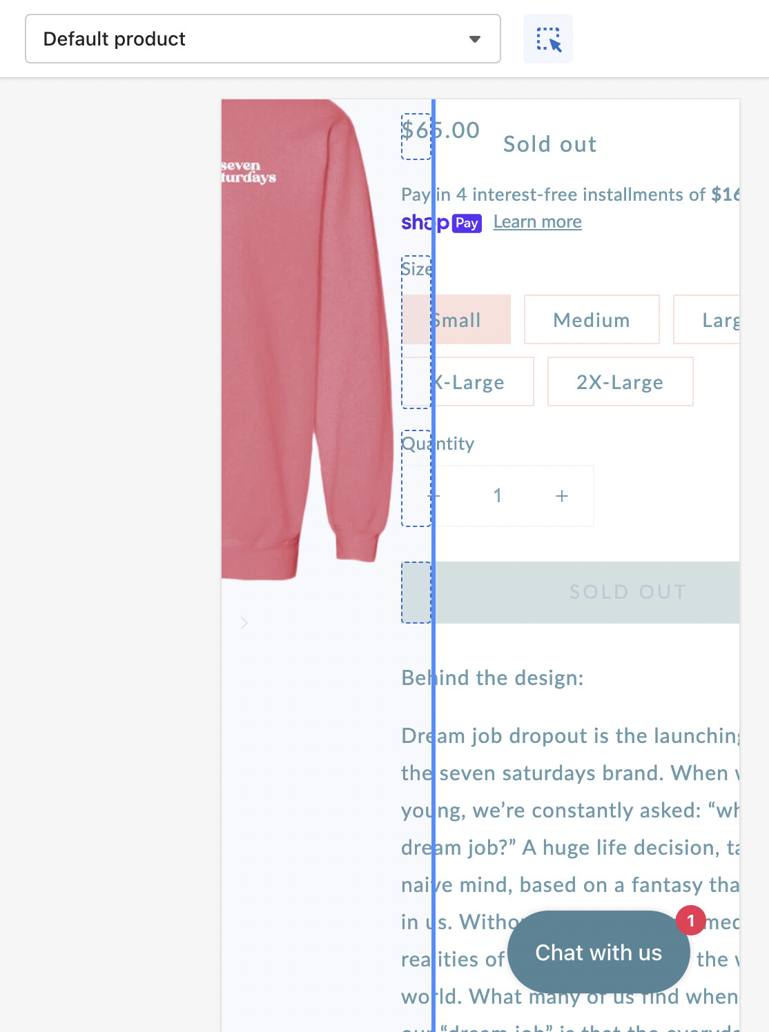
How do I fix this mobile view so that the description and buttons are below the product images?

Hi @msmith4043 ,
Please share your store URL and if your store is password protected then please provide password too.
So that we can help you.
Thank you.
ps: shopifyhelp
Its only messed up on the Mobile version
Hi @msmith4043 ,
This is Kate from PageFly - Landing page builder, I’d like to suggest this idea:
Step 1: Go to Online Store->Theme->Edit code
Step 2: Asset->/section-main-product.css->paste below code at the bottom of the file:
@media screen and (max-width: 749px) {
.product {
flex-direction: column;
}
}
Hope my answer will help you
1 Like
THANK YOU THANK YOU!!! It worked. I am so so appreciative of your help!
1 Like
It looks like it’s also happening on my mobile Products page, are you able to suggest a fix here? The product pictures should be going vertically, not horizontally. It’s making me scroll all the way to the right and leaves blank spaces


Hi @msmith4043
This is Kate from PageFly - Landing page builder, I’d like to suggest this idea:
Step 1: Go to Online Store->Theme->Edit code
Step 2: Asset->/section-main-product.css->paste below code at the bottom of the file:
@media screen and (max-width: 750px) {
.grid {
flex-direction: column;
align-items: center;
}
}
Hope my answer will help you