Our main store page works great, no issue. We also run our entire regular website on Shopify. So, I created a custom landing home page where people are directed when our main domain is typed in (bigfoot4x4.com): https://bigfoot-4x4.myshopify.com/pages/bigfoot-4x4-inc-home
The issue arises when this custom page is pulled up on mobile. The top section of the site is partially covered by the Main Menu/Cart area:
I am unsure how to fix this. I probably have some incorrect code or need code added to resolve.
Thanks to anyone who can help!
Hi @bigfoot4x4 ,
Go to your Shopify Admin Panel.
Navigate to Online Store → Themes.
Click on Edit Code (not Customize).
Open the theme.liquid file (found inside the Layout folder).
Scroll down and paste the code just before the tag:
{% if template == 'index' %}

{% endif %}
Thank you for the reply, but this did not work.
Please try this code. @bigfoot4x4
{% if template == 'page.bigfoot-4x4-inc-home' %}

{% endif %}
Thanks again, but still no change.
Where did you paste the code? @bigfoot4x4
Could you please grant me access to the store to implement the code? @bigfoot4x4
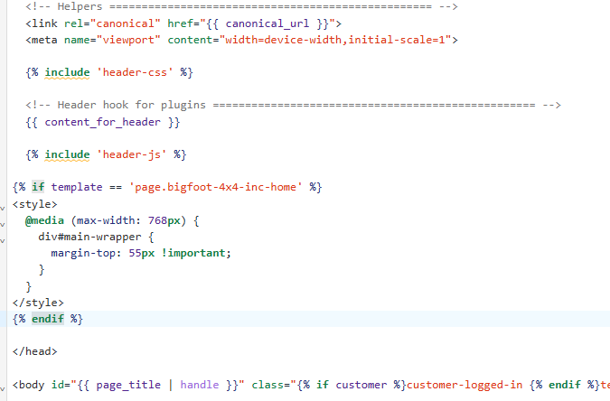
I very much appreciate your help, but I am not allowed top give access. However, I have copied the whole page code below. Would this help? Thanks again!
  {%- if settings.favicon_enable and settings.favicon != nil -%}

  {%- else -%}

  {%- endif -%}


  {%- if page_description -%}

  {%- endif -%}


  {% include 'open-graph-tags' %}
  {% include 'twitter-card' %}


  {% include 'header-css' %}


  {{ content_for_header }}

  {% include 'header-js' %}

{% if template == 'page.bigfoot-4x4-inc-home' %}

{% endif %}


{% if page.url != '/pages/tk' and page.url != '/pages/tk-rules' and page.url != '/pages/results' and page.url != '/pages/about' and page.url != '/pages/pro-mod-rules' and page.url != '/pages/tk-sport-mod-rules' and page.url != '/pages/tk-outlaw-retro-clod-rules' and page.url != '/pages/tk-bigfoot-open-house' %}
  {% section 'header' %}
  {% endif %}


  {%- if template contains "cart" or template contains "404" or template contains "customer" or template contains "page-blank-no-pre-footer" or template contains "blank-no-pre-footer" or template contains "shortcodes" -%}
  {%- else -%}
    {% if page.url != '/pages/tk' and page.url != '/pages/tk-rules' and page.url != '/pages/results' and page.url != '/pages/about' and page.url != '/pages/pro-mod-rules' and page.url != '/pages/tk-sport-mod-rules' and page.url != '/pages/tk-outlaw-retro-clod-rules' and page.url != '/pages/tk-bigfoot-open-house' %}
  {%- section 'pre-footer' -%}
  {%- endif -%}
    {% endif %}

  {%- if template contains "shortcodes" -%}
  {%- else -%}
    {% if page.url != '/pages/tk' and page.url != '/pages/tk-rules' and page.url != '/pages/results' and page.url != '/pages/about' and page.url != '/pages/pro-mod-rules' and page.url != '/pages/tk-sport-mod-rules' and page.url != '/pages/tk-outlaw-retro-clod-rules' and page.url != '/pages/tk-bigfoot-open-house' %}
  {% section 'footer' %}
  {%- endif -%}
     {% endif %}


  {%- if settings.wishlist_button and settings.wishlist_page != blank -%}
  {%- include 'wishlist-messages' -%}
  {%- endif -%}

  {%- if settings.popup_newsletter_enable -%}
  {%- include 'newsletter-popup' -%}
  {%- endif -%}

  {% include 'footer-css' %}
  {% include 'footer-js' %}


  {% include 'navigation-megamenu-block' %}

  {% if settings.enable_custom_javascript %}

  {% include 'custom-javascript' %}
  {% endif %}
Hi @bigfoot4x4 I see it look good. Please double check on this
Sorry for the late reply. Thanks for checking back in, but the mobile site is the issue. It still shows the "half"header. I appreciate your time on this.