Gee3
1
Hi,
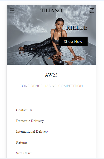
I’ve noticed that the mobile version of my website is not to scale.
-
My header icons are cut off
-
The table in delivery information is not mobile-friendly
-
Even some headers and descriptions on the product page are too large
https://tiliano.co.uk/?_ab=0&_fd=0&_sc=1
P/w: Debut23
Thanks so much
Hi @Gee3
You can follow the following steps:
- Please go to the Online Store
- Then Edit Code
- Please find the theme.liquid file
- Before end of Please add following code.
If this solution is worked, then please Like this and Mark this as accepted solution!
Laddi
Gee3
3
Thank you, it worked!
Please also help me with the table on Domestic Delivery it is too large. The heading is also too large.
Also, the description on the product page is too big.
@Gee3
Please use this css
@media only screen and (max-width: 600px) {
.accordion__content p {
    font-size: 12px !important;
}
}
If this solution is worked, then please Like this and Mark this as accepted solution!
Laddi
Gee3
5
Thank you so much!
Is there any way to reduce the size of the table on domestic delivery?
@Gee3
Inline width working
Can’t do anything
If this solution is worked, then please Like this and Mark this as accepted solution!
Laddi
Gee3
8
Apologies, one more request.
Would you be able to resize the button in the header ‘shop now’
@Gee3
Can you please like and accept the solution?
@Gee3
@media only screen and (max-width: 600px) {
a.button.button--primary {
    min-width: 0rem !important;
}
}
use this css
If this solution is worked, then please Like this and Mark this as accepted solution!
Laddi