Anyone knows how to fix this one?
Hi @niceeee
You embedded the video with a fixed width; please make it responsive to solve the issue.
This is Noah from PageFly - Shopify Page Builder App
Please add code here to fix it:
Step 1: Online Stores > Themes > Edit code
Step 2: Choose file theme.liquid
Step 3: Add code above the tag
Hope my solution will help you resolve the issue.
Best regards,
Noah | PageFly
@Dan-From-Ryviu is right, you need to make the iframe responsive.
You can do it by pasting the following code to the sections “Custom CSS” setting:
p:has(iframe) {
  position:relative;
  padding: 0;
  line-height: 0;
}

p:has(iframe):before {
  content: "";
  display: block;
  padding-top: 56.25%;
  width: 0px;
}
p iframe {
  position: absolute;
  width: 100%;
  height: 100%;
  top: 0;
}


Solution with overflow-x: hidden will crop out about a third of your video
Also, editing the theme code will make updating the theme difficult/impossible – that’s why I recommend using ‘Custom CSS’ setting.
1 Like
Hello @niceeee ,
It’s good practice to create a copy of your theme and work on that to preview the changes before applying, especially if you are editing the raw code. Alternatively, you can also use the Shopify theme editor’s versions to revert to previous versions, but it is not recommended if you are making multiple changes.
Now, to address your specific question about fixing the YouTube iframe from taking more space than available, you can follow the steps below:
- Open the code editor, as shown in the screenshot below.

- Create a snippet called ‘custom-iframe-styles’ and add the below code:
- Include the ‘custom-iframe-styles.liquid’ file in your “theme.liquid” file.
Add the following include code to your theme.liquid file.
{% render 'custom-iframe-styles' %}
It would look something like below:

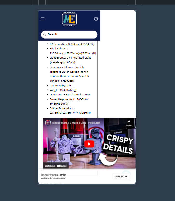
Done? Now save the file, and try previewing to confirm if the changes work for you. In the reference above, it looks something like below:

I hope this helps!
Regards,
Abhishek from Swym