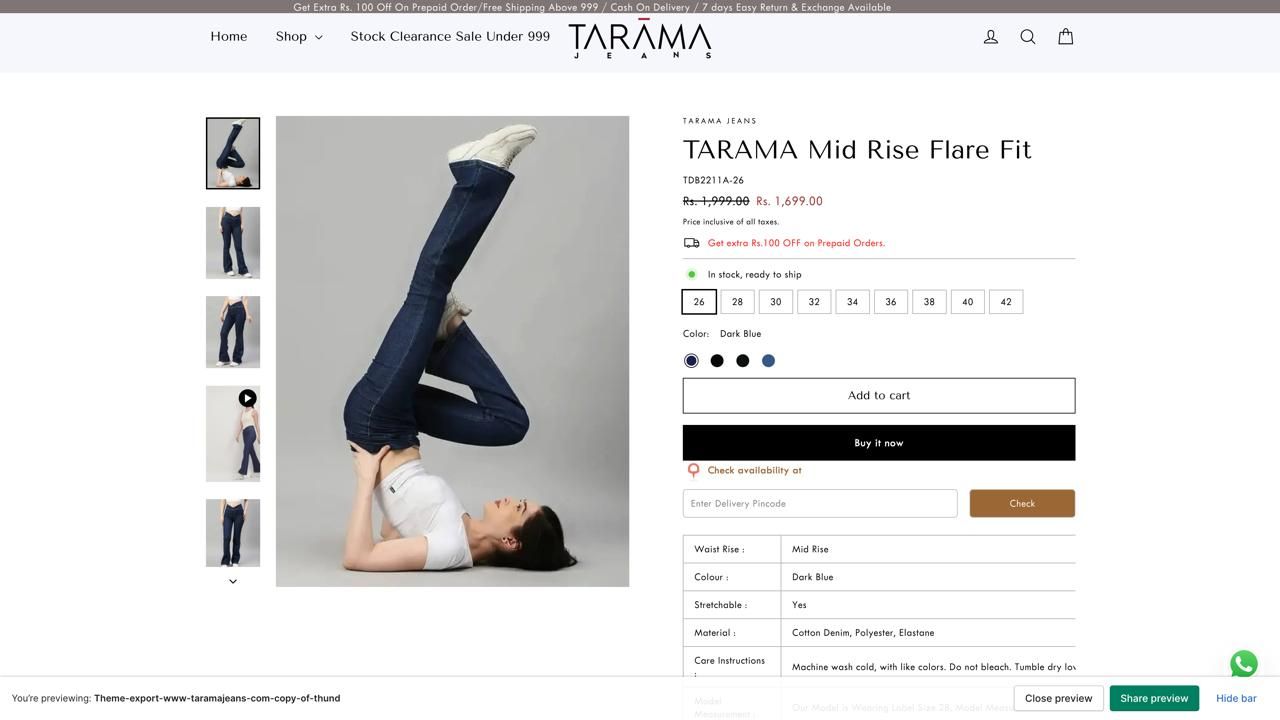
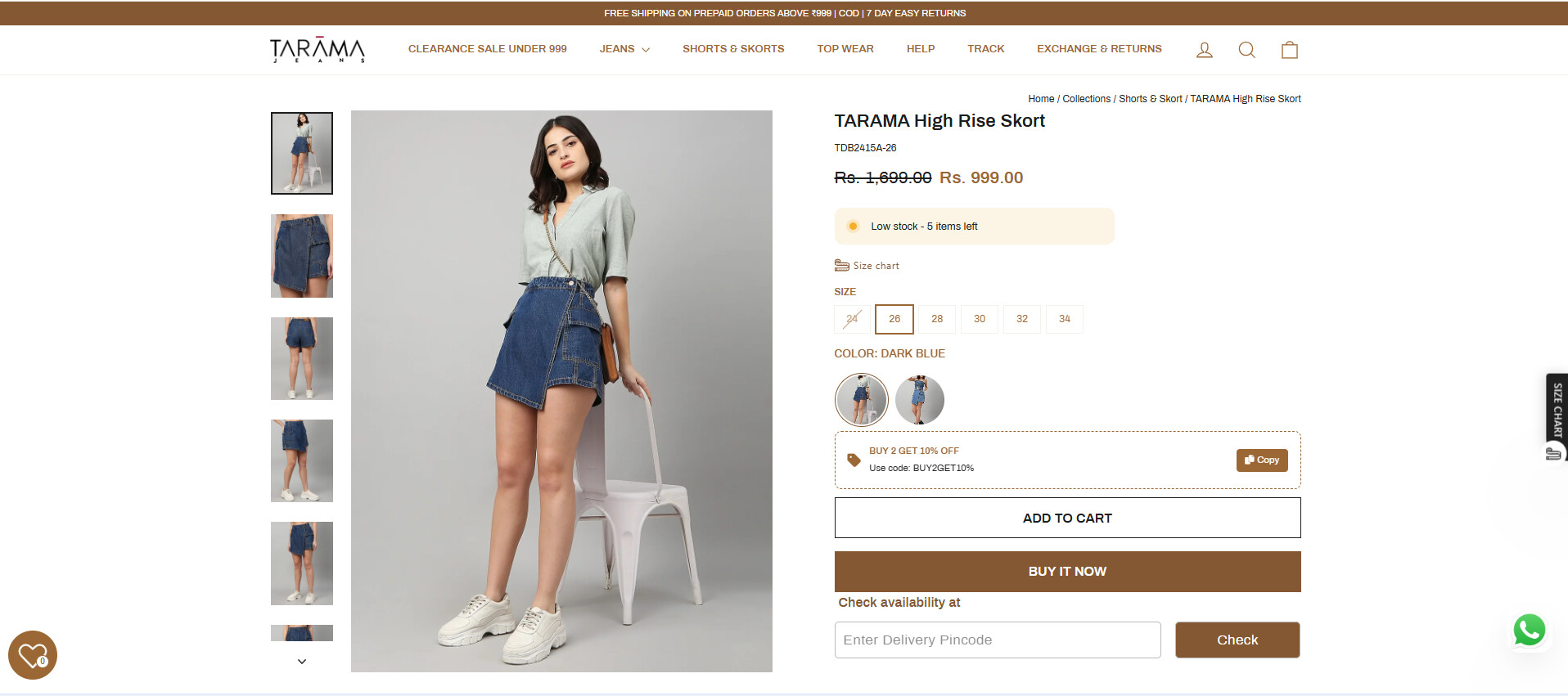
A user seeks to add extra padding and increase the width to 1300px for the product image and content section on their Motion theme product pages, but only on desktop view. They provided reference images showing the current narrow layout versus the desired wider design.
Multiple solutions proposed:
Initial suggestions targeted .page-width globally, which affected the entire site including header, footer, and review sections
More refined solutions use .template-product .product-section .page-width to target only the product section
Implementation methods include adding CSS to base.css, theme.css, or Custom CSS in theme settings
Current status:
The discussion appears to have reached a working solution. The most recent code targets specifically .product-section .page-width with max-width: 1300px !important, which should affect only the product image and content area without impacting other page elements like headers, footers, or review sections.
Summarized with AI on October 29.
AI used: claude-sonnet-4-5-20250929.
For my Motion theme website, I’d like to customize the product page to add extra padding to the product image and its contents, but only for desktop view. I’ve attached a reference image showing the desired design.
@Dan-From-Ryviu It’s working but the entire page like header, reviews, recently bought together etc… is gone to 1300px, but I want only the product image and content to 1300px
@ZestardTech I’ve used this but the entire page is going to 1300px including header, review section, footer and recently bought section, But I want to customize only the product image and product content.