Hi guys,
Am currently setting up my new website and would like to move the Logo to the centre and the menu to the left (on the same level) within the Dawn 2.0 theme. Unfortunately, that option is not an out-of-the-box option in Dawn 2.0 so does anybody here know if and how this can be done?
Website: eagleisabirdie.com
Cheers!
@TGfowler23
Sorry you are facing this issue, it would be my pleasure to help you.
but how can i check your store is password protect so can you please share us so i will check and guide you
Welcome to shopify community.
Please share your store URL and if your store is password protected then please provide password too.
Thank you.
Apologies, completely forgot that it had a password since it is not officially live yet.
pw: trahmu
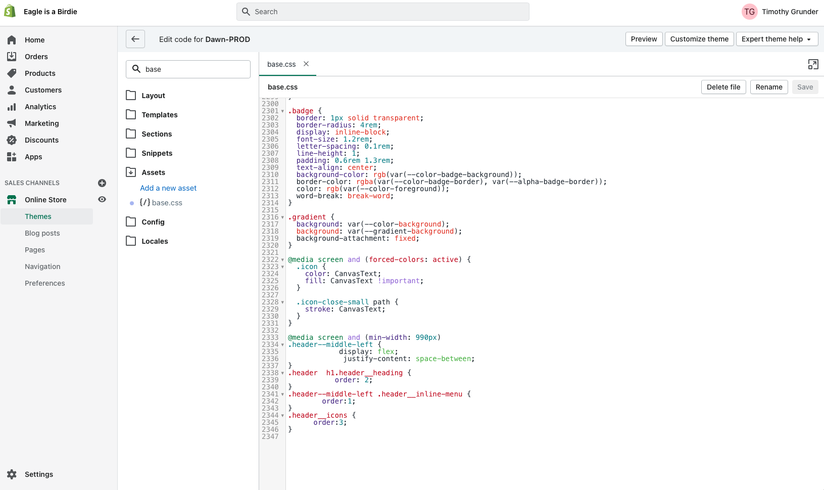
Please add below code in bottom of assets/base.css file
@media screen and (min-width: 990px)
.header–middle-left {
display: flex;
justify-content: space-between;
}
.header h1.header__heading {
order: 2;
}
.header–middle-left .header__inline-menu {
order:1;
}
.header__icons {
order:3;
}
Thank you.
Hi Denishamakwana,
I just injected the code you sent but the website header still looks exactly the same. The logo only moves to the middle in mobile view, while the menu goes to the left and transforms to a hamburger icon.
I would like the Logo to always be in the middle and the menu to always be on the left, not just in mobile view.
Thanks and BR
Hi TGfowler23,
Again I check website in that below code is missing Please check it.
Please add below code in bottom of assets/base.css file
@media screen and (min-width: 990px)
.header–middle-left {
display: flex;
justify-content: space-between;
}
so, Your problem may be solved in desktop view.
Thank you.
Hi Denishamakwana,
That is weird because if you look at the print screen I made, I pasted the exact code snipped you sent me in to the assets/base.css file (and obviously saved it).
So how come you cannot see that and why is it still not working? Do I need to insert the code in another area or way?
Thanks again and BR
1 Like
@Denishamakwana @KetanKumar could one of you please have a look and get back to me (password has been provided). Haven’t heard anything back and am still stuck here. TY in advance!
Hi,
Sorry for late reply,
I need to check admin side code and css .
so you can Hire me . Please direct mail me in below mail id:
Email:denishabhensdadiya@gmail.com
So, I can solve your problem.
Thank you.
First, remove the CSS code you inserted, it’ll not work well with the CSS grid that Dawn is using.
Then find this code in assets/base.css around line 1907:
Change this
grid-template-areas: 'heading navigation icons';
grid-template-columns: auto auto 1fr;
to this
grid-template-areas: 'navigation heading icons';
grid-template-columns: 1fr auto 1fr;
That should get you the desired result.
3 Likes
Hi @ThomasBorowski , thanks a lot for your suggestion. This worked instantly!
Only one thing that I noticed is, that the responsiveness of the menu at one point behaves a bit “weird”, because instead of directly transforming into a hamburger, it first does that:
I’d rather have the menu transforming to a hamburger immediately, if it doesn’t have space to be in one line anymore.
Do you know how I could fix this?
Thank you so much!
That’s to be expected and can’t be avoided easily. Since you want the logo to be in the middle, the areas to the left and right of the logo need to have the same width and therefore the area left of the logo, where the menu is located now, has less room available than when it was in the middle so it will break onto a second line when there’s not enough room left and only turns into a hamburger menu below a specific viewport width that is below the width at where the menu currently breaks.
1 Like
Alright I see. So I assume the solution to match the viewport width the same as the width where the page currently breaks is not so straighforward like you say @ThomasBorowski ? Or do you maybe have some reference url or documentation I could take in order to see how I can achieve that?
You could play around with the navigation’s font size, padding, etc. but there’s no 100 % reliable way to make the menu just wide enough so it won’t break, at least not in CSS only. Only way would be via JS, but that would be overkill IMO.
1 Like
Thank you very much Thomas! In that case all my questions have been answered in this thread and I consider the matter closed
Thank you- it is such a simple fix but it took me forever to find this thread!