Hi,
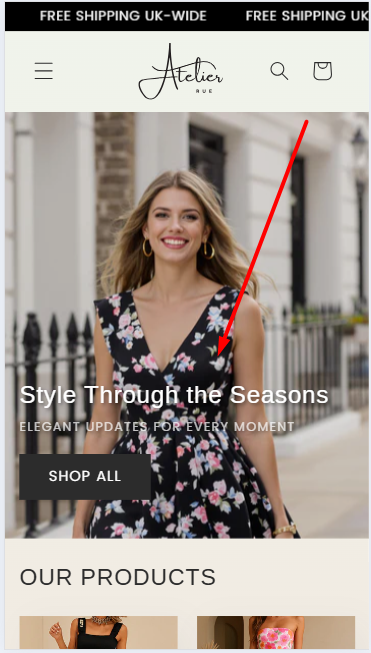
The text and button elements are locked for the mobile positioning and cannot move.

Please help me move it down.
Here is my URL: https://atelier-rue.myshopify.com/
PWD: 12345
Thank you
Hi,
The text and button elements are locked for the mobile positioning and cannot move.
Please help me move it down.
Here is my URL: https://atelier-rue.myshopify.com/
PWD: 12345
Thank you
Hello @vincentthegoat
Go to online store ----> themes ----> actions ----> edit code ----> assets ----> section-image-banner.css
add this code at the end of the file and save.
@media screen and (max-width: 749px) {
.banner:not(.banner--mobile-bottom):not(.email-signup-banner) .banner__box {
top: 3rem !important;
}
}
result
If this was helpful, hit the like button and accept the solution.
Thanks
Go to online store ----> themes ----> go to three Dots ----> edit code ---->find theme.liquid files ----> place the code ---->
before the body ----->
if this code work please do not forget to like and mark it solution
Hello @vincentthegoat ,
Here are the steps to apply the necessary changes in your Shopify store:
@media screen and (max-width:750px){
.banner__box {
    padding: 2rem 1.5rem !important;
}
}
Let me know if you need further assistance!
You can try to follow this step
Step 1: Go to Edit code
Step 2: Find file base.css and add this code at the end of the file
@media screen and (max-width:768px){
.banner__box {
    padding-top: 10px !important;
}
}
Result
Best,
DaisyVo