Multi-row section cuts off information on mobile

Topic summary

A user is experiencing layout issues with the multi-row section in the Dawn theme on mobile devices. The section displays correctly on desktop but on mobile, text and images are being cut off and images appear oversized.

Current Problem:

  • Mobile version shows enlarged images that cut off content
  • Desktop layout works as intended with proper side-by-side formatting
  • The graphic includes text embedded in a PNG file

Desired Outcome:

  • Make mobile layout match the desktop version
  • Display images and text side-by-side in a smaller format on mobile
  • Maintain the same proportional sizing across devices

The user has provided screenshots showing the current mobile appearance and is seeking CSS or configuration solutions to achieve consistent responsive design across devices.

Summarized with AI on November 19. AI used: claude-sonnet-4-5-20250929.

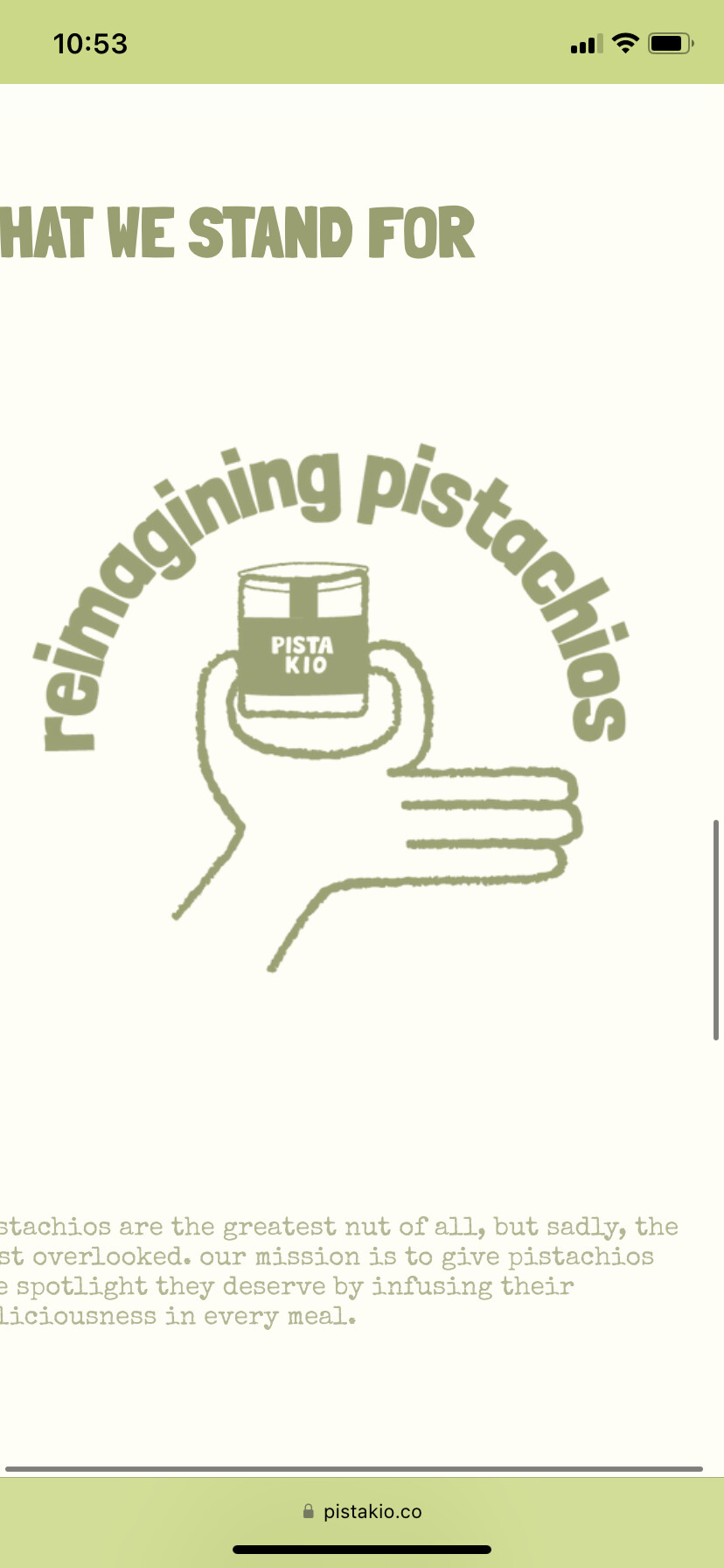
hi, i have an issue with the multi-row section on the dawn theme with mobile version. it’s cutting off the text and image on the mobile but it looks perfect on the desktop. i would like for the mobile to have the same layout as the desktop and not as huge of an image like it has right now. (the graphic with the text is a png). is it possible to make the mobile version side by side (image and text) in a smaller format?? any help would be greatly appreciated. i’ve provided two images of how they look right now and the URL of my shopify store.


https://pistakio.co/

hi! and thank you for helping!

is there anyway i can have the images to be smaller and side-by-side with the text? i’d love them to look like they do on desktop.

thank you!