Hi there,
I inserted a multicolumn section at the end of this page: https://taneraskin.com/products/peeling-handschuh
And the icons are too large. I used a code for the same section on the homepage, so I thought I could just copy it and insert the new number (19921507942668__multicolumn_ARqxJi), but it doesnt work.
Any idea how to do this??
This is the code I added at the end of base.css for the same section on the landing page:
.section-template–19921507778828__multicolumn_ggPawF-padding .multicolumn-card__image-wrapper–third-width {
max-width: 15%;
}
@media (min-width: 550px) and (max-width: 989px){
.multicolumn-card__image-wrapper–third-width {
width: 10%;
}
ul#Slider-template–19921507778828__multicolumn_ggPawF {
display: grid;
grid-template-columns: repeat(4, 1fr);
width: auto;
gap: 2px;
}
.section-template–19921507778828__multicolumn_ggPawF-padding .multicolumn-list:not(.slider) .center .multicolumn-card__info {
padding-left: 0px;
padding-right: 0px;
}
Best,
Isabelle
Hi @isabellemaria ,
Step 1: Go to Shopify Admin → Online Store ->Theme → Edit code
Step 2: Search file base.css, theme.css, styles.css, custom.css or theme.scss.liquid
Step 3: Insert the below code at the bottom of the file → Save
body:has(.product__info-wrapper) .multicolumn-card__image-wrapper--third-width {
    width: 17% !important;
}
Here is result:
Hope this can help you,
If our suggestions are useful, please let us know by giving it a like or marking it as a solution. Thank you 
1 Like
This worked in theme.liquid, thanks! Do you also have an idea how to display the whole multicolumn section (text and icons) all four boxes next to eachother in mobile layout?
Hi @isabellemaria ,
I think with 4 boxes it will be too small compared to the mobile screen. It will look like this
1 Like
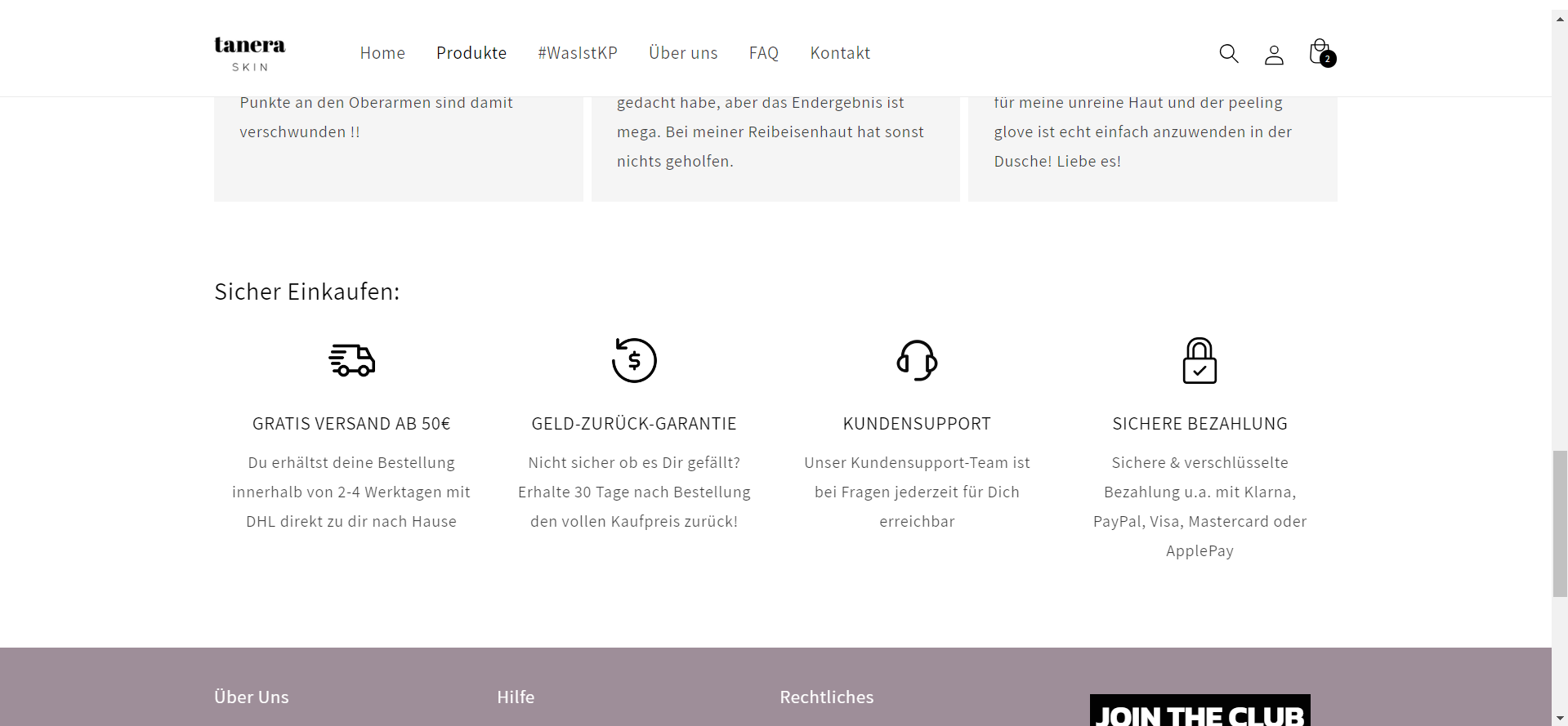
I see, you are right. Do you know why the code I have now works everywhere, but does not make my icons smaller on this page? https://taneraskin.com/collections/produkte
Hi @isabellemaria , Because this is a collection page, you need to add this code to your theme.liquid file similar to above
body:has(.collection) .multicolumn-card__image-wrapper--third-width {
    width: 17% !important;
}
Here is result:
Hope this can help you,
If our suggestions are useful, please let us know by giving it a like or marking it as a solution. Thank you
1 Like
@isabellemaria It seems } is missing at the end in the provided code, please add it and let me know whether it works.
.section-template--19921507942668__multicolumn_ARqxJi-padding .multicolumn-card__image-wrapper--third-width {
    max-width: 15%;
}

@media (min-width: 550px) and (max-width: 989px) {
    .multicolumn-card__image-wrapper--third-width {
        width: 10%;
    }

    ul#Slider-template--19921507942668__multicolumn_ARqxJi {
        display: grid;
        grid-template-columns: repeat(4, 1fr);
        width: auto;
        gap: 2px;
    }

    .section-template--19921507942668__multicolumn_ARqxJi-padding .multicolumn-list:not(.slider) .center .multicolumn-card__info {
        padding-left: 0px;
        padding-right: 0px;
    }
}
Please provide your support by click “Like” and “Accepted” if our solution works for you. Thanks for your support.
1 Like