Hi everyone,
How can I fix this?? Looks bad on desktop and mobile.
Also, how to I change the text size on mobile only? Thanks
Website URL: https://07c55c-77.myshopify.com/
Pass: odeiff
Hi everyone,
How can I fix this?? Looks bad on desktop and mobile.
Also, how to I change the text size on mobile only? Thanks
Website URL: https://07c55c-77.myshopify.com/
Pass: odeiff
Hi @Blueweb
Check this one.
From your Shopify admin dashboard, click on “Online Store” and then “Themes”.
Find the theme that you want to edit and click on “Actions” and then “Edit code”.
In the “Assets” folder, click on “base.css, style.css or theme.css” file, depending on which file your theme uses to store its CSS styles. At the bottom of the file, add the following CSS code:
.page-width.page-width--narrow.section-template--22572521586990__main-padding, article.article-template {
    width: 95%;
    margin: auto;
}
And Save.
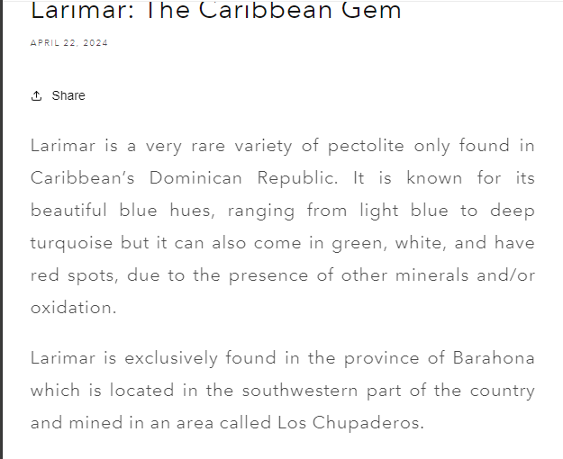
Result:
For the text size, do you mean the content? the header/ subheader. This one is for the content.
@media only screen and (max-width: 749px){
.article-template__content {
    font-size: 20px;
}
}
And Save.
Same instruction.
Please don’t forget to Like and Mark Solution to the post that helped you. Thanks!
Thank you!
For the text size, I mean the header, sorry.
No worries, check this code then.
h1.article-template__title {
    font-size: 35px;
}
And Save.
Same Instruction.
Please don’t forget to Like and Mark Solution to the post that helped you. Thanks!