Hi there, I have a lot of brands listed in one dropdown of my megamenu, I am hoping to split these into columns.
@flothreads - can you please share this page link?
@flothreads - please add this css to the very end of your base.css file and check
@media screen and (min-width:750px){
.mega-menu .mega-menu__list--condensed {display: flex !important; flex-wrap: wrap;}
.mega-menu__list li{flex-basis: 17%;}
}
That’s wonderful, thank you.
Is there a chance you can help me reduce the spacing and remove the underline for this tab of the menu please?
@flothreads - add this as well
.mega-menu__link--level-2 {text-decoration: none !important;}
.mega-menu__link:hover, .mega-menu__link--active{text-decoration: none !important;}
spacing is due to width 17%, you can adjust it as per your need, I recommend to keep spacing so that menu looks good on desktop
Also Looking for help. Added the code to Base css and did not change anything.
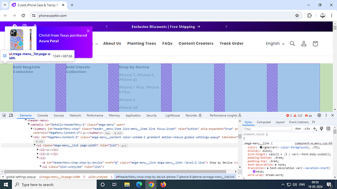
@PhoneCases - your mega menu is divided into 6 parts, hence it does not have space to expand and that is why it is difficult to expand menu into multiple columns
Not sure I understand. I am looking to create 3 columns for the “shop by device”
@PhoneCases - shop by device does not have enough space to create 3 columns
That makes more since. Thanks for the visual. So I guess it is what it is?
@PhoneCases - it can be changed but will need many css changes and in future it would be difficult to add new menu option after shop by device

