Hi everyone,
I recently added a video background on my client’s website from a Youtube video I watched. But the site doesn’t look right when its on Mobile version compared to its Desktop version. This is my top concern right now.
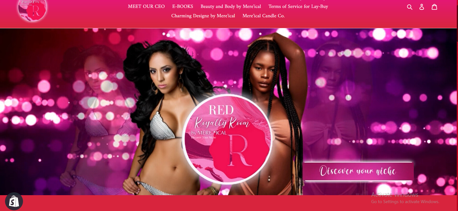
This is how it looks like on Desktop mode
And this is how it looks like on Mobile mode
This is the website - https://mereical.myshopify.com/
I only know a few HTML/CSS coding so I’m stuck. Hoping y’all can help me out. Thank you!
@redroyaltyroom
sorry for that issue can you please try this code
- Go to Online Store->Theme->Edit code
- Asset->/theme.css ->paste below code at the bottom of the file.
@media screen and (max-width: 767px) {
.videoBackground .videoBox {min-height: 380px !important;}
}
Hello!
Thank you so much for replying with a solution, I appreciate it a lot.
Although I’m having another problem because the black area is appearing below the video banner
Can you help me with this? Thank you.
1 Like
@redroyaltyroom
thanks for update
sorry but this part of video we’re doesn’t modification to code sorry