PKL
1
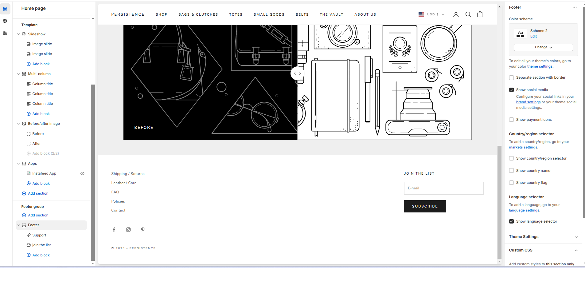
Hi, I’m using Prestige theme v. 10.4, and I want to update my footer so that :
-
The footer menu is horizontal (on computer screen)
-
the newsletter subscribe button is beside the email box instead of under it
-
the newsletter section is right justified (as it already is), but vertically aligned with the social links and copyright.
Any suggestions?
Many thanks!
PS – I tried uploading a screenshot, but it didn’t let me add a .jpg. I’ll try again in a reply.
PKL
2
here’s a photo showing what I have and what I want:
DaisyVo
3
Hi @PKL
Please share your store URl and password
Best,
Daisy
DaisyVo
5
HI @PKL
To complete your 1 and 2 requests, please follow these steps:
- Go to Shopify Admin > Online Store > Theme > Customize > Theme Settings > Custom CSS https://prnt.sc/i8ljAMlHJUKl
- Paste the code provided into the Custom CSS section.
@media screen and (min-width: 768px){
.footer__block.footer__block--links ul.v-stack.unstyled-list {
    display: flex !important;
    column-gap: 20px !important;
}
.footer__block.footer__block--links {
    max-width: unset !important;
}
.footer__block-list {
    display: grid !important;
    grid-template-columns: 2fr 1fr;
}
}
.footer__block.footer__block--newsletter form.form {
    display: flex !important;
    gap: 5px;
}
Here is the result: https://prnt.sc/oWmLvLdHirKl, https://prnt.sc/zbHmgpBdwp2W
With the 3rd request, please share with us the screenshot of this part so we can take a look https://prnt.sc/K5Tvvn0-JaXG
I hope this helps
Best,
Daisy
Hello @PKL
Go to online store ----> themes ----> actions ----> edit code ---->base.css
add this code at the end of the file and save.
.v-stack {
grid-template-columns: minmax(0, 1fr);
align-content: start;
display: flex !important;
}
.footer__block--links, .footer__block--image {
flex-grow: 0;
max-width: 30rem !important;
}
Thanks
PKL
7
Thank you, that code worked great. Is this what you need for the second part?
DaisyVo
8
Hi @PKL
Please add this code more into the same place above
@media screen and (min-width: 1024px){
.footer__block-list {
    position: relative;
}
.footer__block.footer__block--newsletter {
    position: absolute;
    right: 0;
    top: 100%;
}
}
Here is the result: https://prnt.sc/H7x8X6utCxSg
I hope this helps
Best,
Daisy