Hello everyone,
I am trying to find help with adjusting the position and size of my images on the product page.
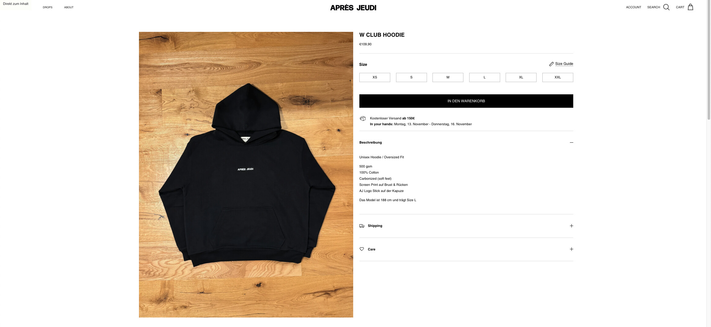
This is my store right now:
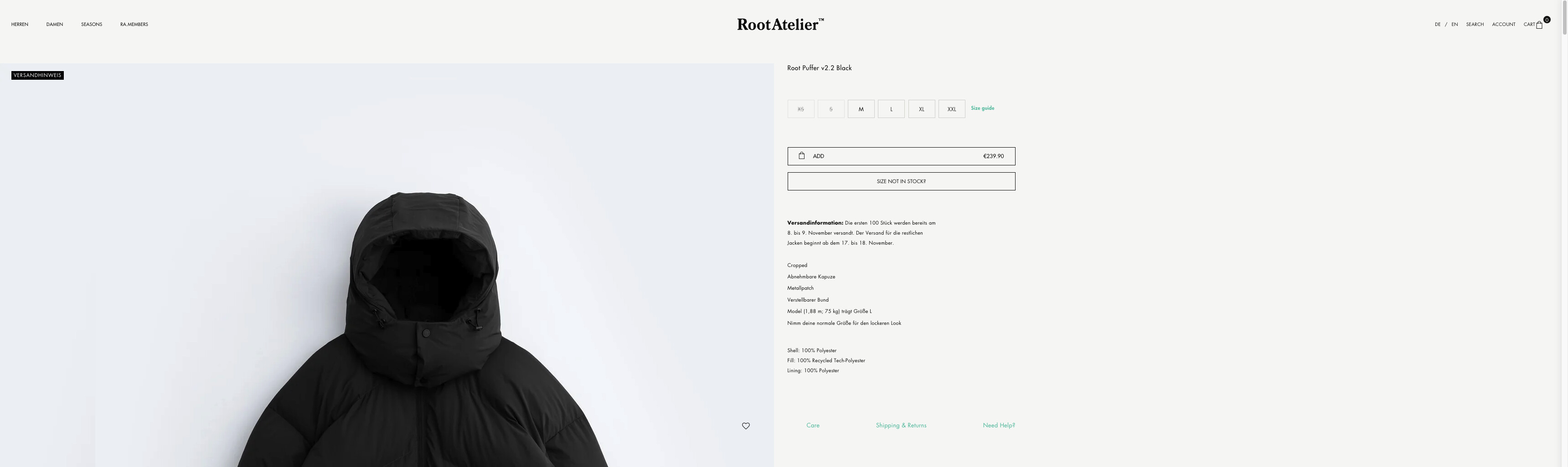
I would like to have the images always being positioned on the full left side of the browser like on the image below.
I found out how to adjust the size of the image but when I make it bigger than 100% in the code, the image starts moving to the right and I want the right side part of the product page to always stay in the middle. So basically the dividing line between left and right should stay in the same place (middle) but the image should always fill the full left side of the product page.
I hope my explanation is not too complicated and I can find some help here.
Of course the coffee is on me when we find a solution 
The url is apresjeudi.com and pw is Apres1990
Best regards,
David
Hi @davidjahn
Please add this code at the bottom of your style.css file
.template-product .product-detail.container {
margin-left: 0px;
}
Hi @Dan-From-Ryviu
Thank you for you quick answer. This is a good first step. Now the image size has to get bigger and the right part of the product page has to stay center at any time.
Please update code to this and check
.template-product .product-detail.container {
    margin-left: 0;
    max-width: 1600px;
}
@media (min-width: 1040px) {
.template-product .product-detail .gallery-size-large {
    width: 55%;
}
.template-product .product-detail .gallery-size-large+.product-column-right {
    width: calc(35% - 1px);
    margin: 0 auto;
}
}
Hey @Dan-From-Ryviu
sorry for the late reply.
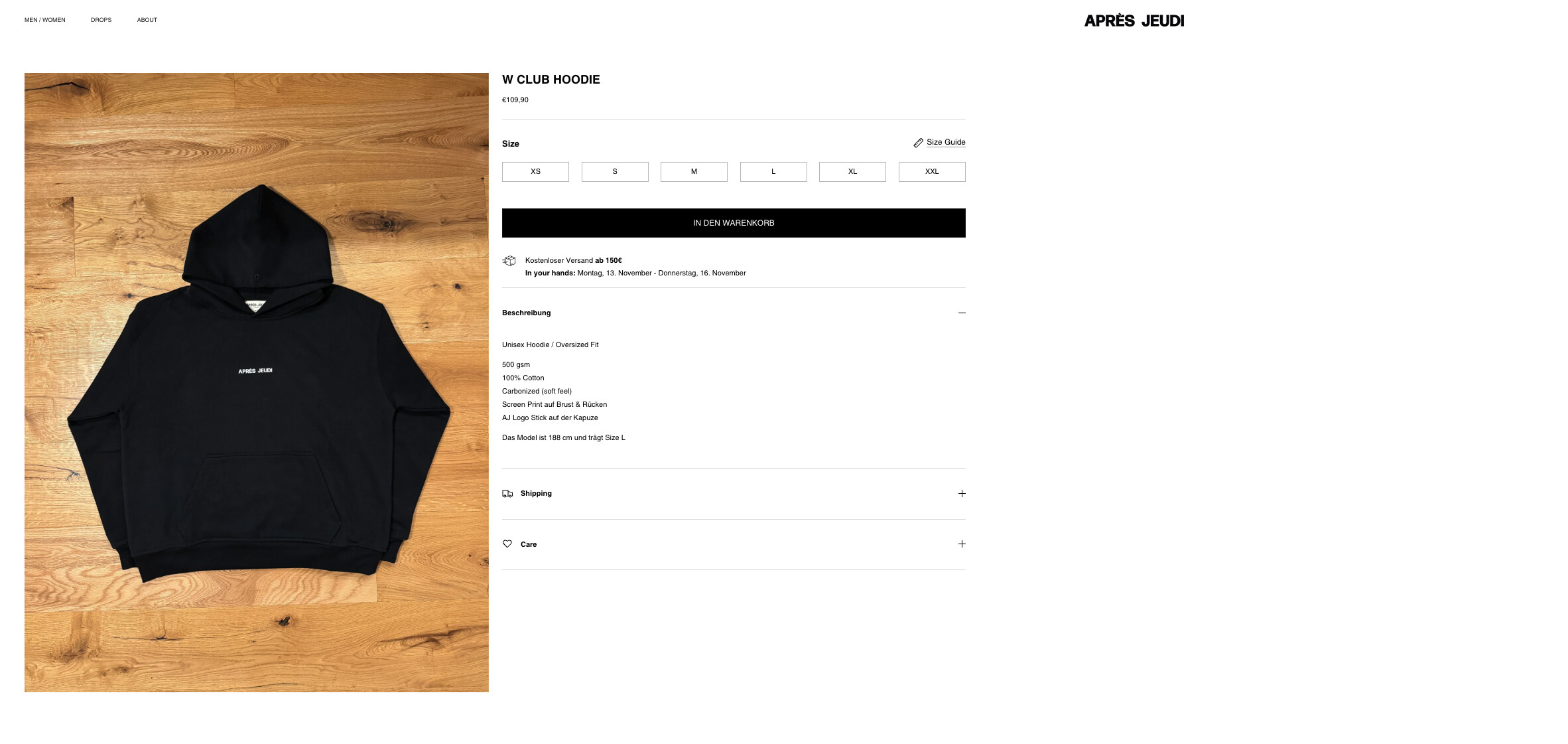
This code just makes the image a bit bigger but not much. Even if I change the 55% to 100% its not filling the full left side of the browser.
And as you can see on the picture below, the dividing line between the two sides doesn´t stay in the middle when I change the browser size.
On the pages of RootAtelier and Represent for example it works as I would like to have it. But I´m sure you know what I mean.
Thanks for your ongoing help!
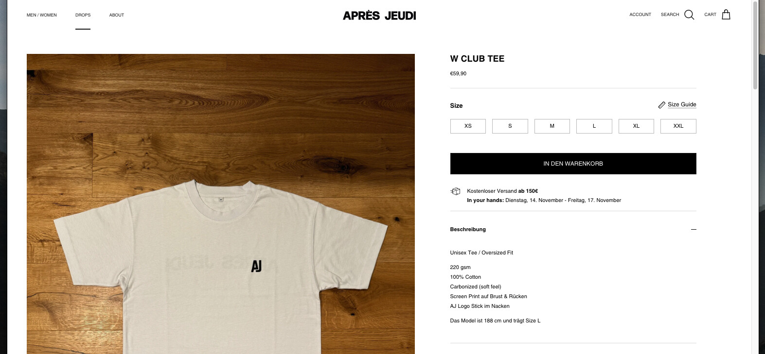
Hi @davidjahn
Is it ok to be like this one?
Yes this also looks pretty good but I´m just curious what others do different to get the picture moving all the way to the left
But most important for me is, that the middle always stays in the middle regardless of the browser size.
Please update code to this
.template-product .product-detail.container {
    margin-left: 0;
    max-width: 100%;
    padding-left: 20px;
}
@media (min-width: 1040px) {
.template-product .product-detail .gallery-size-large {
    width: 50%;
}
.template-product .product-detail .gallery-size-large+.product-column-right {
    width: calc(35% - 1px);
}
}
That´s beautiful! Is there any problem changing padding-left to 0px ? This would bring the pictures all the way to the left side.
And just one last question: Can we remove the space between the pictures when scrolling?
Thank you so much for you help! Coffee is on the way
Hi @davidjahn
It’s ok, but please update the code to this so that content on mobile doesn’t get too close to the left screen.
.template-product .product-detail.container {
    margin-left: 0;
    max-width: 100%;
    padding-left: 0px;
}
@media (min-width: 1040px) {
.template-product .product-detail .gallery-size-large {
    width: 50%;
}
.template-product .product-detail .gallery-size-large+.product-column-right {
    width: calc(35% - 1px);
}
}
@media (max-width: 767px) {
.template-product .product-detail.container {
    padding-left: 16px;
}
}