I am currently trying to customize my mandolin theme and I have encountered a problem.
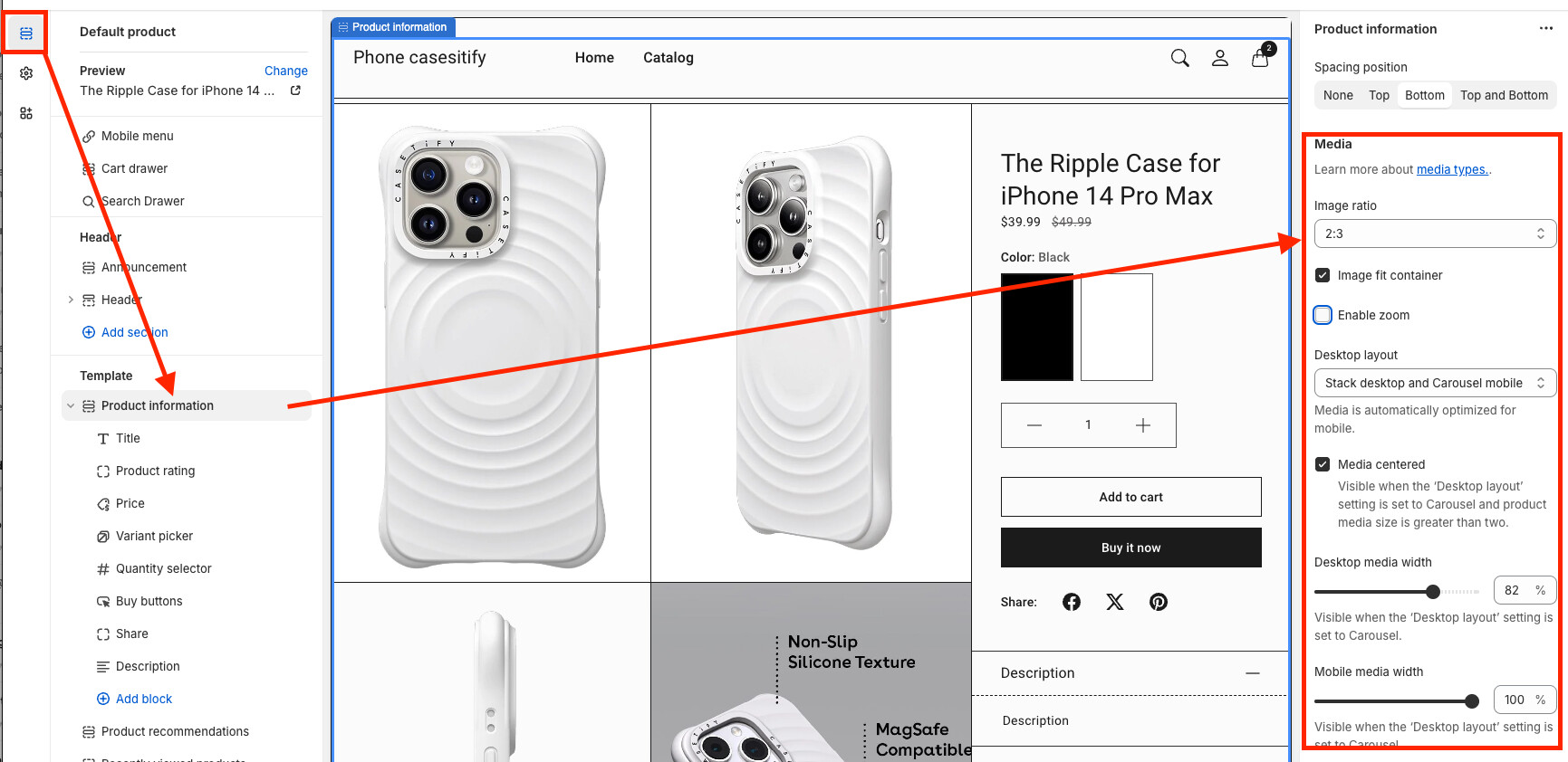
I have my product images set to stack on desktop and carousel on mobile but I cannot change the images sizes.
I want my pictures to stack vertically so that the right side sticks statically and you actually scroll, but nothing ever changes as if the 2 product images were glued together.
I am pretty new to css and html but I tried every method I saw online and none helped.
I hope I have given enough information for anyone to be able to help
thank you for your response and your help. I have tried many different settings and even changed the images sizes in hope it would change. Sadly nothing has helped for me so far.
My goal is to have always 1 image on the left at the same x-position.
Fixed it myself with no coding experience since nobody else would reply lol
I changed these from 50% to 100% in the component-product-gallery-stacks-carousel.css
