Lover
July 9, 2024, 11:58am
1
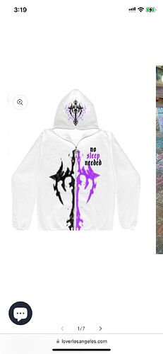
Hello! Im facing two isses. The first is that when I press on a product image, the image zooms in like crazy. I edited it using this code below - which helped on desktop but has not helped on mobile (ill attach the image below).
Code used:
{% if template contains ‘product’ %}
.product-media-modal__content.gradient {
max-width: 65em;
margin: 0 auto;
}
{% endif %}
Mobile Product Image when clicked:
Note that this is the studio theme.
Can You share your Site Url?
Lover
July 9, 2024, 12:03pm
3
Add this code in your edit code > base.css file
@media screen and (max-width:767px){
	.product-media-modal__content.gradient {
	    max-width: 90% !important;
	}
	.product-media-modal__content.gradient img {
    	width: 100% !important;
	}
}
Lover
July 9, 2024, 12:23pm
5
That worked!!! any idea how to make it open in a way that doesnt clash with “categories” as seen below on mobile?
Add this css in your edit code > base.css file
.product-media-modal[open]{
    z-index: 999 !important;
}
Lover
July 9, 2024, 1:04pm
7
Thank you! that worked out!!!
Lover
July 10, 2024, 12:22pm
8
Hello I have another question! For some reason there has been extra space and pading over the image before we click it in some products now?


