Hello,
I am currently working on a client’s website and am having some trouble with the footer in the Craft Theme.
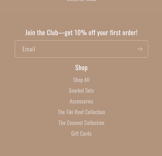
Is anyone able to please assist with coding to adjust the order of the footer when displayed on mobile? I’d like it to display as Newsletter, Menu, Menu, Brand Information (socials). It is currently Menu, Brand Information (socials), Menu, Newsletter)
The preview link is https://6q1u2kxrbdn5pgvn-65874886903.shopifypreview.com/
Thank you so much in advance.
Hello @BellesandBells ,
Follow these steps:
-
Go to Online Store → Theme → Edit code
-
Open your base.css file and paste the following code at the bottom:
@media only screen and (max-width: 767px) {
.footer__content-top.page-width {
    display: flex;
    flex-direction: column;
}
.footer-block--newsletter {
    order: 0;
}
.footer__content-top.page-width  .footer__blocks-wrapper {
    order: 1;
}
.footer .footer__blocks-wrapper.grid {
    display: flex;
}
.footer-block.grid__item{
margin: 0 !important;
}
.footer .footer__blocks-wrapper.grid div:nth-child(2) {
    order: 3;
}
}
If problem solved don’t forget to Like it and Mark it as Solution!
And if you need help with customization/code part you can contact me for services
You can find the email in the signature below.
Thanks
1 Like
Hi @Guleria
Thank you so much, that worked perfectly!
Is there another bit of code I can add to adjust the line spacing between the newsletter and the first menu?
Thank you @Guleria
One last issue - is there any way to adjust the padding between the menus and the Copyright text on desktop view? I have attached a photo.
Thank you!
Use this css
@media screen and (min-width: 767px){
.footer-block--newsletter.scroll-trigger.animate--slide-in {
    display: none;
}
}
1 Like
Hi @Guleria
This has removed the gap, however, it has also now removed the newsletter form. Can you please assist?

