Hi,
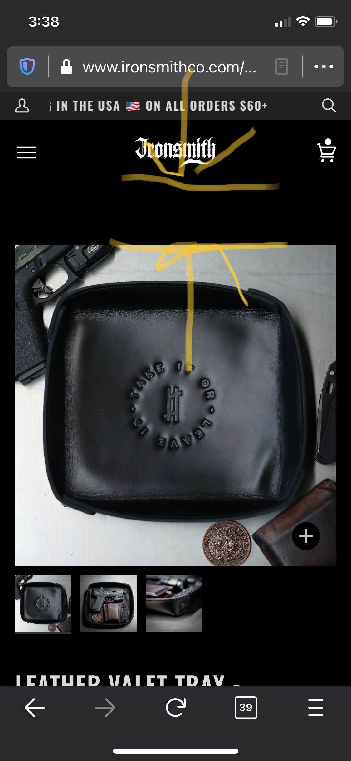
I’ve been working on trying to reduce the padding on my store for mobile (ironsmithco.com) in two locations:
Product page - Between the product image and header
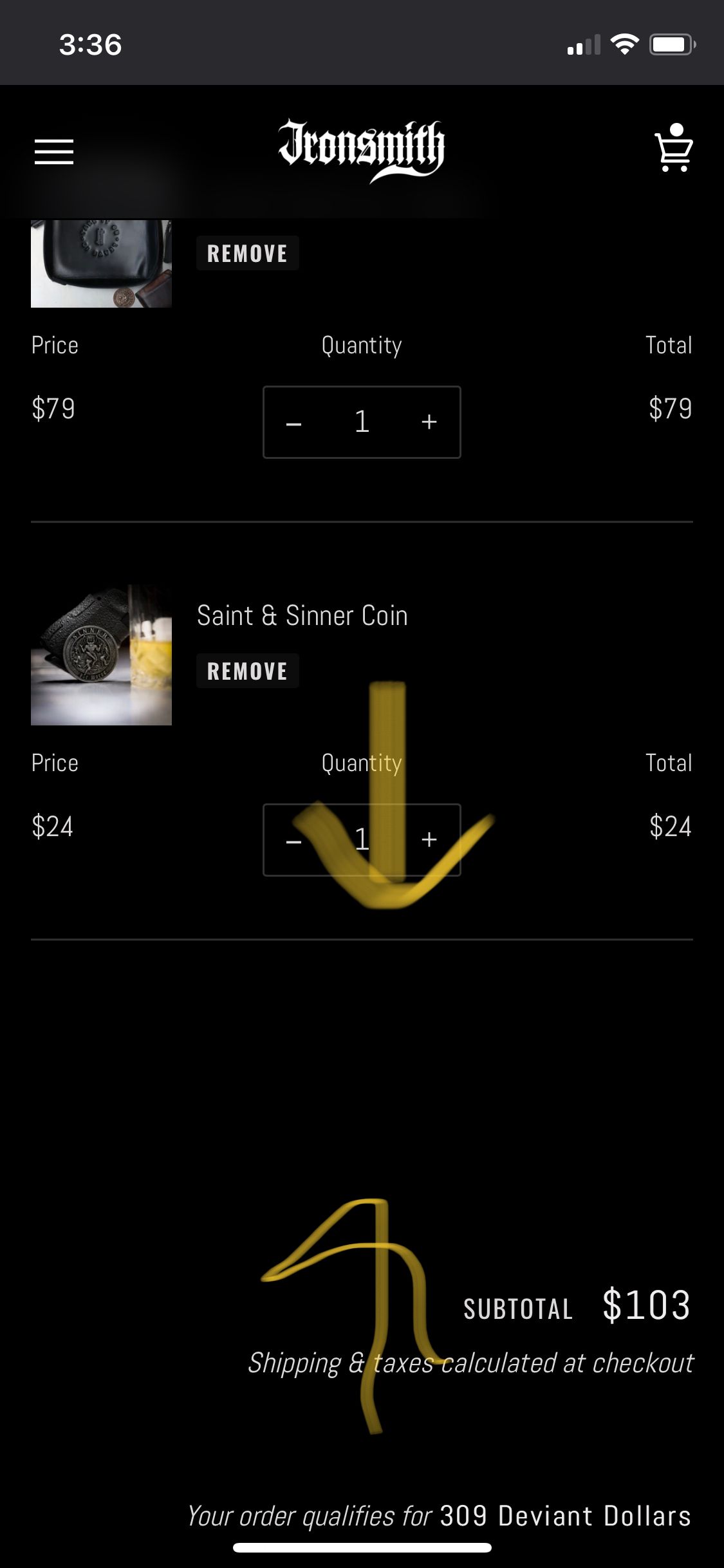
Cart Page - Between the last cart item and subtotal text
I’m on the newest version of the Pipeline theme. Has anyone else run into this issue and have a solution? Thank you!
-Chris
Hello There,
Please share your store URL and screenshot.
So that I will check and let you know the exact solution here.
hello @Chris184 please Go to Online Store->Theme->Edit code then go to assets/theme.css ->paste below code at the bottom of the file.
@media only screen and (max-width: 769px) {
 #shopify-section-product .product-section .product-page{
    padding-top: 0 !important;
}
 #shopify-section-cart .cart  .wrapper form .cart__row  .grid .grid__item:nth-child(1){
     display:none;
 }
}
1 Like
Worked perfectly, Thank you so much!
Hello There,
- In your Shopify Admin go to online store > themes > actions > edit code
- Find Asset >theme.css and paste this at the bottom of the file:
@media only screen and (max-width: 769px) {
#shopify-section-product .product-section .product-page{
padding-top: 0 !important;
}
#shopify-section-cart .cart .wrapper form .cart__row .grid .grid__item:nth-child(1){
display:none;
}
}
Kindly feel free to get back to me if you need any further assistance Thanks!