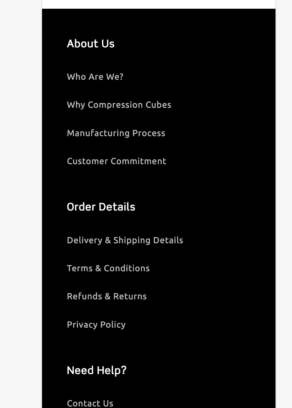
Wondering if anyone knows how to stack the footer into two columns & center the content on mobile? It’s currently left aligned and in one column as shown below.
Any help would be amazing! I’ve tried pasting some codes from other themes but it hasn’t worked. Current theme is Refresh Theme.
Hello @shanagarryceo ,
It’s the GemPages Support Team and we are glad to assist you today!
Could you please share your store URL ( with the password if your store password is enabled ) then I can see and suggest something for you?
Best regards,
GemPages Support Team
Hi @shanagarryceo
Can you kindly share your store link (with the password, if any) with us? We will check it and suggest you a solution if possible.
Hi,
Thanks for the help, password is nietro
Store is here
Hi @shanagarryceo
Please follow these steps:
- Step 1: Open Theme => Edit code:
- Step 2: Search file “base.css” or “theme.css” and add code at the end:
@media screen and (max-width: 749px){
.footer .grid {
    display: grid;
    grid-template-columns: 1fr 1fr;
    row-gap: 1rem;
    text-align: center;
}
.grid > .footer-block.grid__item:not(.footer-block--menu) {
    grid-column: 1 / span 2;
}

}
and note that in some parts you need to remove attributes on these elements:
.footer-block.grid__item {
	/* margin: 4rem 0; */
}
.list-menu__item {
    /* display: flex; */
    /* align-items: center; */
}
- Step 3: Save and see the result. You will get the result like this:
I hope that this can help you solve the issue.
Hi @shanagarryceo ,
This is Kate from PageFly - Landing page builder, I’d like to suggest this idea:
Step 1: Go to Online Store->Theme->Edit code
Step 2: Asset->/section-footer.css->paste below code at the bottom of the file:
@media screen and (max-width: 749px) {
    .footer__content-top {
        padding-left: 20px;
        padding-right: 20px;
    }
    .footer .grid {
        display: grid;
        grid-template-columns: 1fr 1fr;
        row-gap: 10px;
        text-align: center;
    }
    .footer-block.grid__item {
        margin-top: 0 !important;
    }
    .list-menu__item {
        justify-content: center;
    }
}
I hope it would help you
Best regards,
Kate | PageFly
Amazing Kate! Works perfectly  One more question, do you know how to centre the image in the footer on mobile? See below, the image is aligned left
Hi @shanagarryceo ,
Sorry for late reply.
I don’t see your logo.
Best regards,
Kate | PageFly
hey how to reduce the gap between menu links and social media icons?