ste285
October 12, 2025, 11:58am
1
Hi,
How do I move the text box to be as the screenshot ?
Vertical column on the right side of the screen
Text that is right-aligned
Ability to change font size and box size
The website is About – Khodkina . the text is on a text block, withing an “Image banner” on the Shopify editor.
1 Like
Hey @ste285 ,
The requested changes requires to do the custom code in your theme file. Could you please share the Store url and collab code in the p/m so that i can take a look and implement the requested changes.
Best,Daniel Smith
1 Like
Hi @ste285
In your Shopify Admin go to online store > themes > actions > edit code
Find Asset > base.css and paste this at the bottow of the file:
.banner {
  position: relative;
  overflow: hidden; /* text image ke bahar na nikle */
}

.banner__box {
  position: absolute;
  top: 20%;
  right: 20%;
  transform: translateY(0);
  width: 18%;
  text-align: right;
  font-size: 13px;
  line-height: 1.5;
  font-weight: 400;
  color: #c94b4b;
  background: transparent;
  padding: 0;
  word-wrap: break-word;
}

.banner__box p {
  margin: 0;
  max-width: 100%;
}
@media (max-width: 1024px) {
  .banner__box {
    width: 25%;
    top: 18%;
    right: 3%;
    font-size: 12px;
  }
}

/* Mobile view */
@media (max-width: 768px) {
  .banner__box {
    position: relative;
    width: 90%;
    right: 0;
    top: 0;
    transform: none;
    text-align: center;
    color: #000;
    margin: 20px auto 0;
  }
}
1 Like
ste285
October 12, 2025, 1:40pm
4
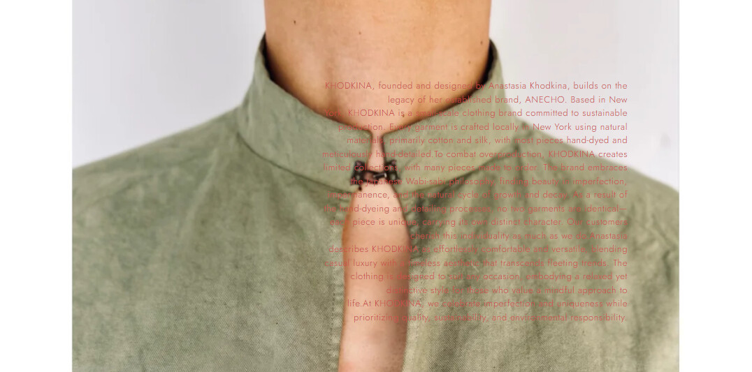
Wow. Thanks you. This is the closest I’ve gotten to move it. However, seems like something is overriding it. This is the output from your code.
1 Like
Hi @ste285
Try this code.
.banner {
  position: relative !important;
  overflow: hidden !important;
}

.banner__box {
  position: absolute !important;
  top: 20% !important;
  right: 20% !important;
  transform: translateY(0) !important;
  width: 18% !important;
  text-align: right !important;
  font-size: 13px !important;
  line-height: 1.5 !important;
  font-weight: 400 !important;
  color: #c94b4b !important;
  background: transparent !important;
  padding: 0 !important;
  word-wrap: break-word !important;
}

.banner__box p {
  margin: 0 !important;
  max-width: 100% !important;
}

@media (max-width: 1024px) {
  .banner__box {
    width: 25% !important;
    top: 18% !important;
    right: 3% !important;
    font-size: 12px !important;
  }
}

@media (max-width: 768px) {
  .banner__box {
    position: relative !important;
    width: 90% !important;
    right: 0 !important;
    top: 0 !important;
    transform: none !important;
    text-align: center !important;
    color: #000 !important;
    margin: 20px auto 0 !important;
  }
}
1 Like
ste285
October 12, 2025, 1:58pm
6
the original code actually worked, but by inserting in the Custom CSS of the Image Banner element
Hi @ste285
1 Like
ste285
October 12, 2025, 2:02pm
8
well. I will try the new code. By applying the original to only the Custom CSS. The mobile view won’t show any text
ste285
October 12, 2025, 2:03pm
9
new code seems to be working. I just need to adjust the position
1 Like
Hi @ste285
Thank you for your response. It’s good to know that it’s worked for you. Kindly feel free to get back to me if you need any further assistance. If helpful, please like posts.
1 Like
ste285
October 12, 2025, 2:06pm
11
this worked! thank you sooooooo much.
1 Like

