I would like to remove the paddings in the screenshots below from the collections in mobile view (the green and purple ones).
I’ve already figured out how to do this on desktop, but I’ve tried literally everything to remove it from mobile view and can’t get anywhere.
This is the code in the base.css file that removes the paddings on desktop view:
/*Show products in collections at full width in desktop view (Collections like All items)*/
@media screen and (min-width: 0px) {
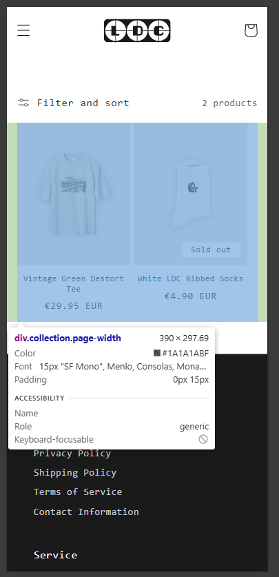
.collection.page-width {
padding: 0 0rem !important;
max-width: none !important;
}
}
/*Show products in featured collection at full width in desktop view (Frontpage)*/
@media screen and (min-width: 0px) {
.slider-mobile-gutter.page-width {
padding: 0 0rem !important;
max-width: none !important;
}
}
From your Shopify admin dashboard, click on “Online Store” and then “Themes”.
Find the theme that you want to edit and click on “Actions” and then “Edit code”.
In the “Assets” folder, click on “base.css, style.css or theme.css” file, depending on which file your theme uses to store its CSS styles. At the bottom of the file, add the following CSS code:
@media only screen and (max-width: 749px){
.collection.page-width {
    padding: 0;
}
.collection .grid__item {
    max-width: 50%;
}
}
Hi, like I already said I added the code at the bottom of the base.css files and unfortunately it doenst work. Please correct me if I did something wrong, but the code is at the end of the base.css file (see red frame in the screenshot) and the paddings are still there.