Hello,
There is a litte too much padding either side of my rich text in mobile, how can I remove some so that all of my text is on one line? I would also like to centre this specific text in mobile.
URL: https://www.livwithin.com.au/
PW: pewpog
A user is experiencing excessive horizontal padding on rich text elements in mobile view, causing text to wrap across multiple lines instead of displaying on one line. They also want to center this specific text on mobile devices.
Two solutions were provided:
CSS modification to section-rich-text.css file - Reduces padding to 20px for general page width and removes padding entirely for rich text wrapper on screens under 749px width. A screenshot shows the expected result.
Custom CSS added to theme.liquid - Insert CSS code above the </head> tag in the theme.liquid file to adjust mobile padding and center the text.
Both solutions use media queries targeting mobile screens (max-width: 749px) to override default padding values. The discussion remains open with no confirmation from the original poster about which solution worked.
Hello,
There is a litte too much padding either side of my rich text in mobile, how can I remove some so that all of my text is on one line? I would also like to centre this specific text in mobile.
URL: https://www.livwithin.com.au/
PW: pewpog
Hi @ellacoker
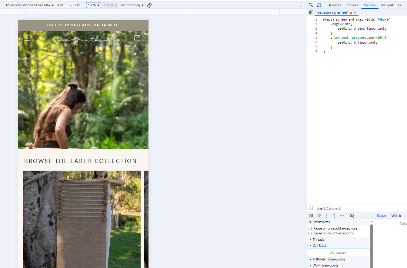
Thanks for reaching out shopify community. here is set of css you can add to section-rich-text.css file
@media screen and (max-width: 749px){
	.page-width{
		padding: 0 20px !important;
	}
	.rich-text__wrapper.page-width{
		padding: 0 !important;
	}
}
Output:
Hi @ellacoker
This is Richard from PageFly - Shopify Page Builder App
Please add this code to your theme.liquid above the to get this solved
Step 1: Online Stores > Themes > More Actions > Edit code
Step 2: click on theme.liquid and paste the code above the
Hope this can help you solve the issue
Best regards,
Richard | PageFly