my website: blinglittlething.com
I want to do this, please help:
Every change is only for smaller screens,
-
Remove padding in main collection page
-
Remove space between product cards completely.
-
This should not impact any other grid items in the website.
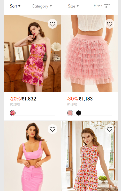
Is there some coding possible for this? Please look into it. Here’s a screenshot reference of what i am looking for:
Hi @blinglittlethin
Please follow these steps:
-
Step 1: At Shopify Admin, select Online Store → Themes → Edit Code
-
Step 2: Find and open the theme.css file, then add this code at the end of the base.css file:
@media screen and (max-width: 749px){
  .facets-vertical.page-width.collection-page {
     padding: 0 !important;
  }

  .collection .grid__item.collection-page {
     max-witdh: 100% !important;
  }

  .collection .grid.collection-page {
     column-gap: unset;
  }
}
- Step 3: Find and open the theme.liquid file, add this code above as shown below:
I hope that this can help you solve the issue.
it did nothing.
My website is www.blinglittlething.com
theme is dawn.
1 Like
Hi @blinglittlethin ,
This is Kate from PageFly - Landing page builder, I’d like to suggest this idea:
Step 1: Go to Online Store->Theme->Edit code
Step 2: Asset->/base.css->paste below code at the bottom of the file:
.product-grid-container #product-grid {
    gap: 0 !important;
    --grid-desktop-horizontal-spacing: 1px !important;
}
I hope it would help you
Best regards,
Kate | PageFly
does nothing. probably missing some steps
1 Like
Hi @blinglittlethin ,
I checked again. Maybe you can fix it?
hey, so yes i found that there was some minor issue, fixed it. Thank you.
But now what is happening is that it is becoming mis-aligned with this facet container. (I applied the code only for smaller screens so check with a smaller perspective : www.blinglittlething.com )
here is a sample ss. can you please help.
and not just that one, i guess, it must’ve been misaligned with all the other sections on the page as well, since we have only edited the grid, the others need to be sized down or the grid needs to be sized up i guess. i’m a beginner so that’s just some guess work.
1 Like
Hi @blinglittlethin ,
In this topic, I have a solution to handle this problem for you. You can try it out:
https://community.shopify.com/c/shopify-design/customise-quot-product-count-quot-facet/td-p/1937467
I hope it would help you
Best regards,
Kate | PageFly