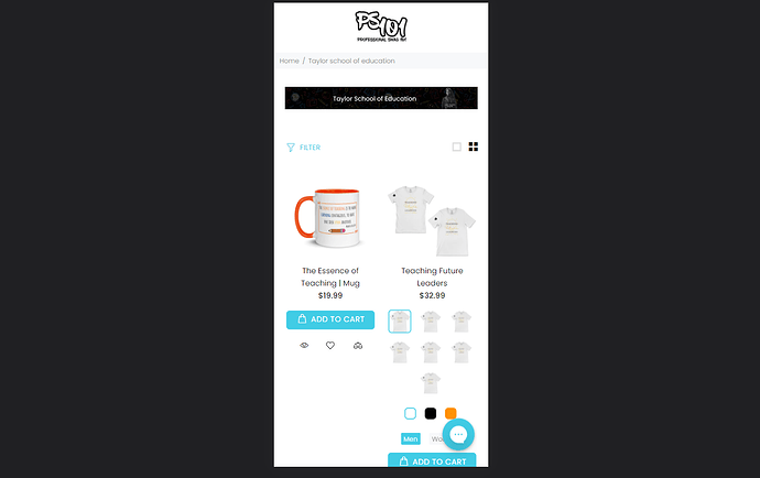
How do I resize my featured collection image to show for mobile? It shows perfect on desktop but it’s cut off on mobile. I tried to use previous threads, but it still won’t resize.
I also need to add some padding under the collection images so that the filtering menu isn’t so close.
Here is one of my collection pages:
https://www.ps-101.com/collections/taylor-school-of-education-educator-teacher-school-administrator-principals
Hi @bossladyHS !
This is PageFly - Advanced Page Builder. I would love to give you some recommendation
Please paste this code at the bottom of theme.css under assets in theme code files;
@media (max-width: 786px){
.tt-filters-options{
margin-top: 57px !important;
}
}
@media (max-width: 786px){
img{
width: 100% !important ;
}
}
I hope my recommendations will be beneficial for you, let me know if you have any questions. Cheers!
Best Regards;
PageFly
Ok perfect! That worked. But the filtering menu is still close to the banner on the desktop.
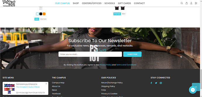
And one last thing, how do I remove this space in between my subscription form and footer.
Homepage: www.ps-101.com
Reply to:
@PageFly-Victor
Hi @bossladyHS You can change px accordingly;
Like this;
No. the spacing is perfect on mobile. It didn’t move on desktop. The code you gave only works on mobile.
And one last thing, how do I remove this space in between my subscription form and footer.
Homepage: www.ps-101.com
No. the spacing is perfect on mobile. It didn’t move on desktop. The code you gave only works on mobile.
And one last thing, how do I remove this space in between my subscription form and footer.
Homepage: www.ps-101.com
Hi @bossladyHS !
Please paste this code at the bottom of index.css under assets in theme code files;
.subsectiontemplate-
-16485253578977__166310855529dea173 .subsectionbg {
margin-bottom: -52px !important ;
}
Like this;
No index.css files in my website code files.

