A user is experiencing an image banner sizing issue on the Dawn theme. The banner displays correctly on mobile (where 90% of their traffic originates) but doesn’t fit properly on desktop screens.
Problem Details:
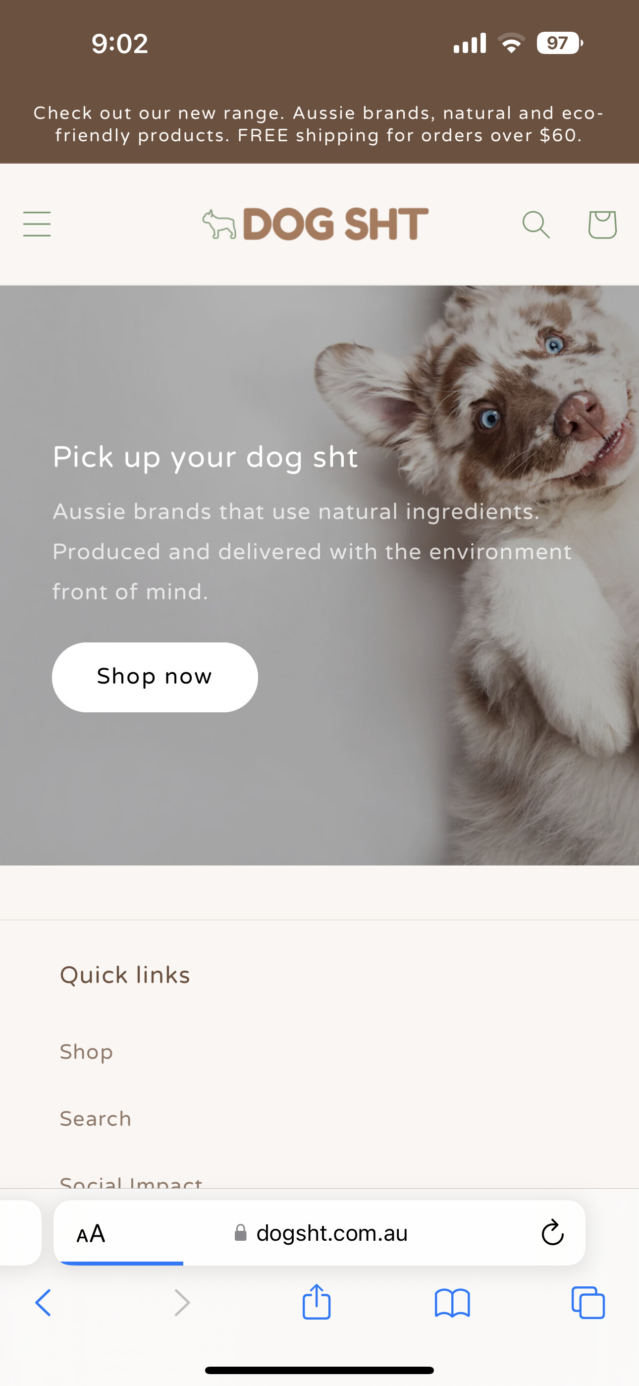
Mobile version appears correctly formatted
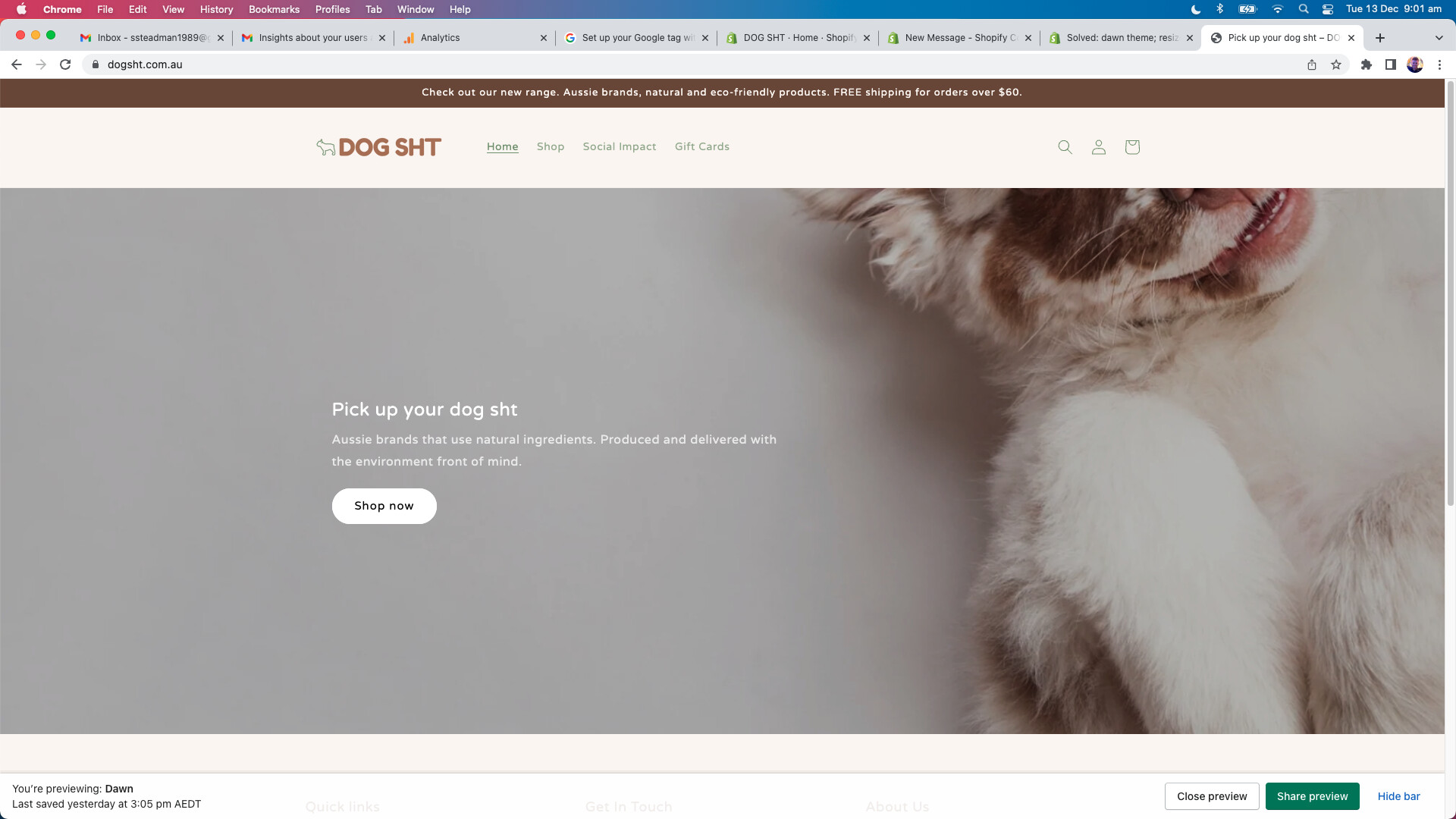
Desktop version shows poor fitting/scaling
User has limited coding experience
Solution Provided:
GemPages support offered a CSS fix involving:
Navigating to Online Store → Theme → Edit code
Opening base.css in the Assets folder
Adding custom CSS media query code at the end of the file
The proposed code targets the banner section with specific object-position and min-width properties for desktop screens. Screenshots were provided showing the expected result after implementation.
Status: Solution has been shared; awaiting user implementation and feedback on whether the fix resolves the desktop display issue.
Summarized with AI on November 24.
AI used: claude-sonnet-4-5-20250929.
I’m trying to resize my image banner to fit nicely on to desktop. As you can see by the below photos it fits well to mobile (which is where 90% of our traffic is from). But it’s not fitting well on desktop. Hopeless over here with coding so any help would be much appreciatted!
