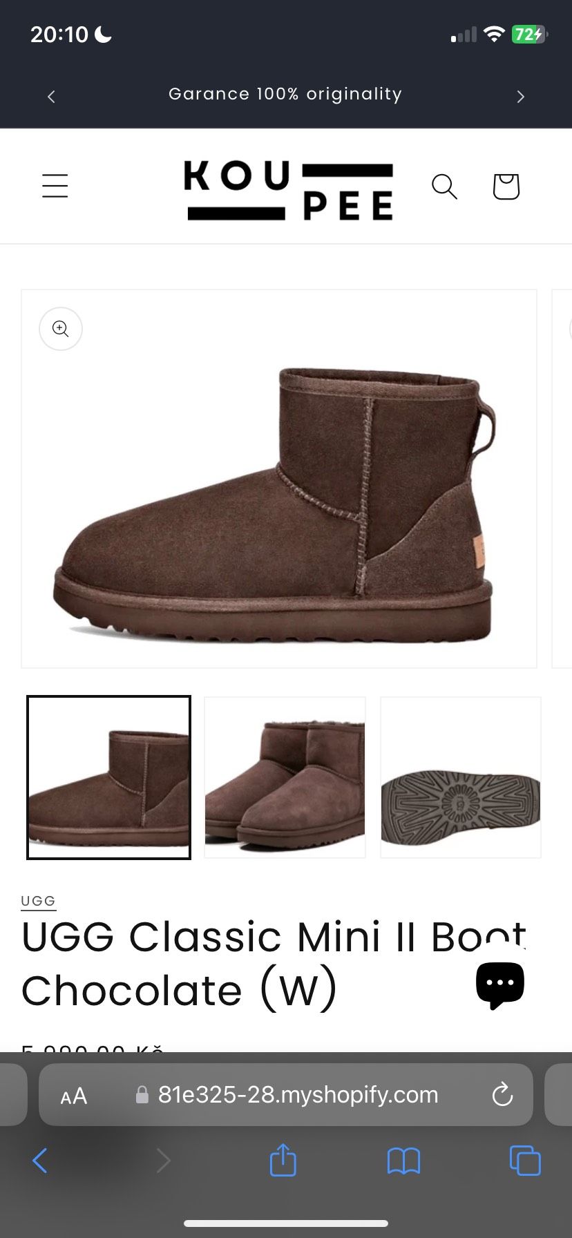
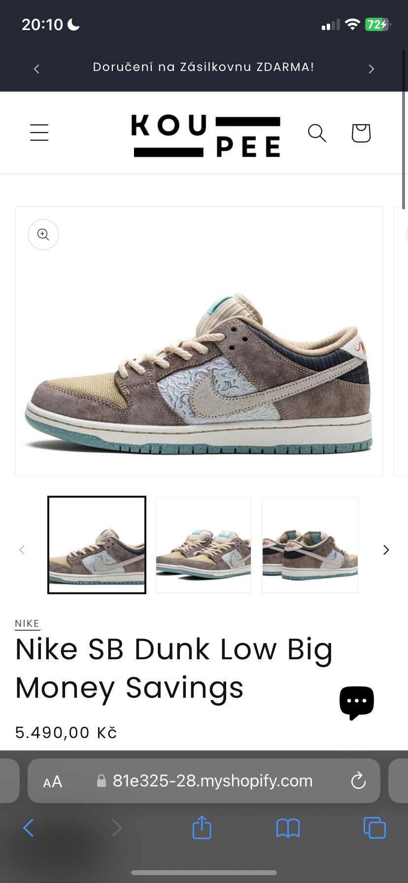
Hello,
i have alreday resized photos on desktop version but i need to resize them aswell on mobile. I want all my shoes to fit in the box. Sending two pictures where the issue is seen. Thank you for you help :))
https://81e325-28.myshopify.com/
0007
A user is experiencing issues with product images (shoes) not fitting properly within their containers on mobile devices, despite having already resized them for desktop.
Problem Details:
Proposed Solution:
Another user provided a CSS code snippet to add to custom CSS:
.thumbnail.global-media-settings img{
  object-fit: contain !important;
}
Status: The solution has been offered but not yet confirmed as working. The responder requested feedback on whether the CSS fix resolves the mobile image sizing issue.
Hello,
i have alreday resized photos on desktop version but i need to resize them aswell on mobile. I want all my shoes to fit in the box. Sending two pictures where the issue is seen. Thank you for you help :))
https://81e325-28.myshopify.com/
0007
Add this to custom CSS
.thumbnail.global-media-settings img{
object-fit:contain!important;
}
If my solution works you can donate below.