Search bar all messed up in mobile mode {Warehouse Theme}

Hello everyone.
Hope you all doing fine.

It’s been two days without sleep trying to fix my store’s search bar.

First of all, my store’s url is www.ibarganha.com . The problem is only happening when the page is opened on a mobile.

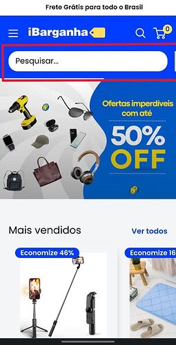
The first problem I notice is when I open the store on phone and click on the magnifying glass in the top right corner. There is a yellow magnifying glass in the right corner that acts as an “enter” that has been thrown off the screen.

The second screenshot was taken when the search field is clicked. In addition to the “enter” in yellow, the word “fechar” which means to close in Portuguese was also thrown off the screen.

I will be very grateful if anyone can help me.
Thanks
Hi @Brunossa ,

I checked and it shows fine, have you tried on another device?

Hi @LitCommerce .
Thanks for your reply.

I have a galaxy s22 and my girlfriend a s21 ultra.
On both devices the bar appears as described in my first post (using the chrome mobile browser).
I also tested it using firefox mobile and the result was the same on both devices.

When I inspect the page using the chrome inspection tool on my PC (and set the page to show as mobile version), the page is displayed correctly, unlike when I access it from my smartphone.

It seems to me that your smartphone is an iphone (sorry if I’m wrong).
Perhaps the problem only occurs on android devices. I’m really lost on this one.