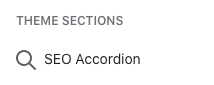
I wondered if anyone could shed some light on how the section icons in the Theme Customizer are assigned. I’ve looked through the docs but can’t see anything about it. I’ve created a new Accordion Section in a client’s theme, and the icon shows a magnifying glass, which is not very intuitive.
Thanks for your reply. There is a screenshot in my message. I’m talking about the icon next to a Shopify Section within the Theme Customizer (not the front end of the site).
The Polaris documentation has a whole article about the icons and how to ensure iconography stays intuitive for the end users… and I’m sitting here trying to name my sections for my client themes something LESS intuitive, just so it has an intuitive icon for visual scanning purposes.
This seems like a major oversight in either the documentation or in functionality. If I can’t customize the keywording for icons, at least tell me what the keyterms are so I can properly understand my options!!