Hi Shopify community,
I am unable to change padding for product main section in my shopify store. When i am changing padding it is changing in both mobile and desktop but i wanted to do different padding on mobile and desktop. I am using below mentioned code in custom css section in theme customized but still unable to fix this issue
/* Mobile */
.t4s-product {
  padding-right: 0px;
  padding-left: 0px;
} /* Tablet */
@media (min-width: 600px) {
  .container {
    padding: 20px;
  }
} /* Desktop */
@media (min-width: 900px) {
  .t4s-product {
    padding-left: 30px;
    padding-right: 30px;
    padding-top: 50px;
    padding-bottom: 50px;
    margin: 50px;
  }
}
I would appreciate if any one can help me in this regards.
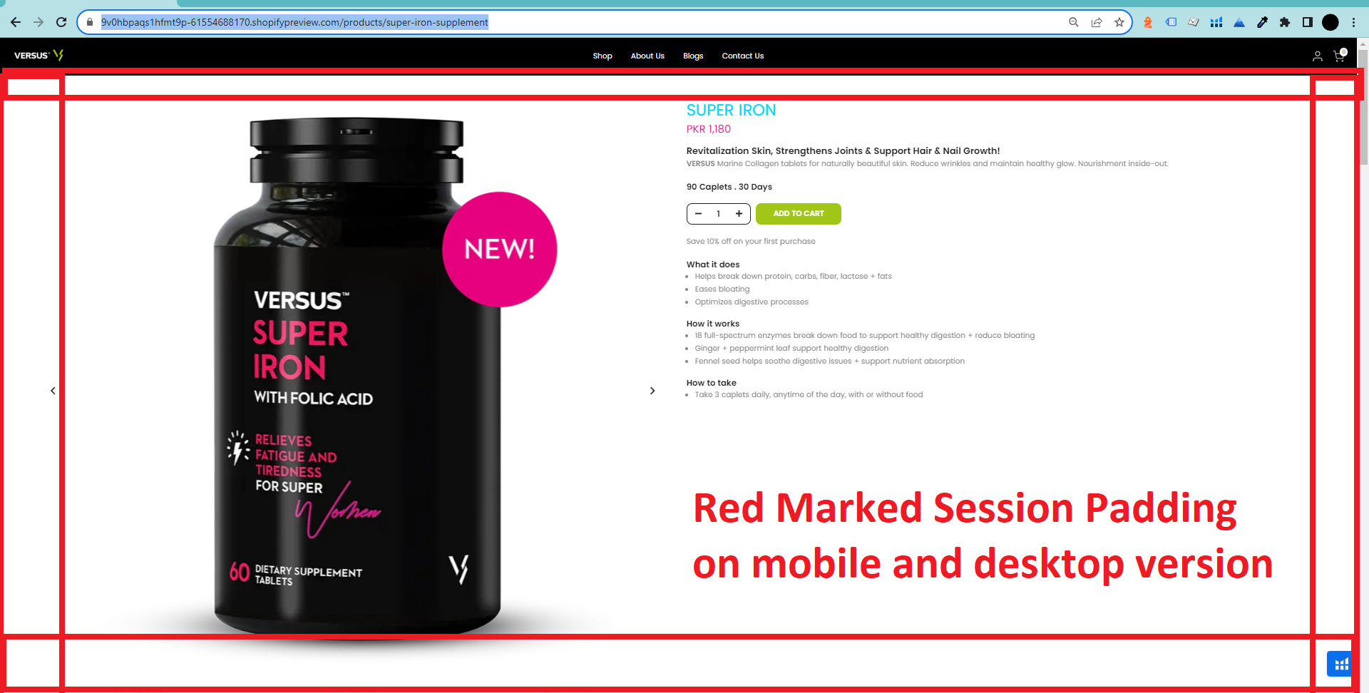
Website URL: https://9v0hbpaqs1hfmt9p-61554688170.shopifypreview.com/products/super-iron-supplement
1 Like
Hi @usmekhan91
Please try to update code to this
/* Mobile */
@media (max-width: 600px){
.t4s-product {
  padding-right: 0px;
  padding-left: 0px;
}
}
/* Tablet */
@media (min-width: 600px) {
  .container {
    padding: 20px;
  }
}
/* Desktop */
@media (min-width: 900px) {
  .t4s-product {
    padding-left: 30px;
    padding-right: 30px;
    padding-top: 50px;
    padding-bottom: 50px;
    margin: 50px;
  }
}
But I have checked and saw those css code is applied for sections that does not have any content
Happy I could help 
Best Regards,
Dan from Ryviu - Product Reviews & QA
Hi @usmekhan91
Check this one.
@media only screen and (min-width: 900px){
.t4s-container.t4s-main-product__content.is--layout_default.t4s-product-media__thumbnails_bottom.t4s-product-thumb-size__small {
  padding: 50px 30px;
  margin: 50px;
  }
}
@media only screen and (min-width: 599px) and (max-width: 899px) {
  .t4s-container.t4s-main-product__content.is--layout_default.t4s-product-media__thumbnails_bottom.t4s-product-thumb-size__small {
    padding: 20px;
  }
}
@media only screen and (max-width: 600px){
.t4s-container.t4s-main-product__content.is--layout_default.t4s-product-media__thumbnails_bottom.t4s-product-thumb-size__small {
    padding: 0px;
  }
}
And Save.
Better to be specific selector, cause you may call another container.
Result:
Please don’t forget to Like and Mark Solution to the post that helped you. Thanks!