Hello everyone,
I am using the shapes theme and I dont see any option to change the following:
-
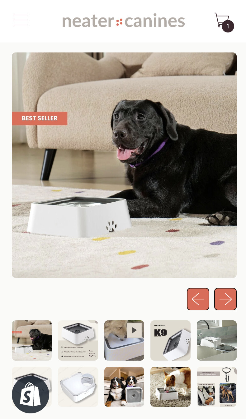
Right now my navigation arrows below my product image which is taking up a lot of real estate. I want to change to the way as seen on the 2nd image.
-
I want my thumbnail images to become a carousel as seen in the attached screenshot.
Been trying to figure it out on my own but without success. Help is much appreciated.
Store: neatercanines.ph
Thanks,
Peter
Hello @Peter_ecom
Please follow the steps below after logging into the Shopify admin:
-
Go to your Shopify Admin panel.
-
Click on Online Store > Themes.
-
Find the theme you want to edit and then click Actions > Edit code.
-
Search base.bundle.css
-
Insert the provided CSS code at the end of the file and save the changes.
@media only screen and (max-width: 749px){
    .product-media > .splide__arrows {
        display: flex !important;
    }

    .section-content .product-media .splide__arrows.mt-4.flex.items-center.justify-end.gap-2.px-section.splide__arrows--ltr {
        display: flex !important;
        position: absolute;
        top: 34%;
        left: 0;
        right: 0;
    }

    .section-content .product-media .controls.relative {
        width: 100%;
    }

    .section-content .product-media .controls.relative .flex.gap-2 {
        align-items: center;
        justify-content: space-between;
    }

    .section-content .product-media button.splide__arrow.splide__arrow--prev.push-btn {
        left: 5px;
    }

    .section-content .product-media button.splide__arrow.splide__arrow--next.push-btn {
        right: 5px;
    }

    .section-content .product-media button.splide__arrow span.push-btn__surface {
        border-radius: 50%;
        background: #dddddd78;
        border: none;
        box-shadow: none;
    }
}
Output : https://prnt.sc/B4LNic8HSzZd
Please hit Like and Mark it as a Solution if you find our reply helpful.