GASTY
June 16, 2024, 7:25am
1
Hi there! Does anyone know how to achieve full page widht on both collection section and product sections?
I’ve managed to make full widht the entire website except for the collection page and product pages. Links here:
https://gastonduflos.com/collections/all-products
https://gastonduflos.com/products/print-1
I’d like to have full widht on all collection and product pages, anyone can help me out with this please???
Hi @GASTY
Step 1. Go to Admin → Online store → Theme > Edit code
Step 2. Find the file base.css. Add the CSS snippet to the end of the file.
@media screen and(min-width: 750px) {
.page-width{
    padding: 0 !important;
    max-width: 100% !important;
}
.collection.page-width {
    padding: 0 20px !important;
    max-width: 100% !important;
}
}
If it helps you, please like and mark it as the solution.
Best Regards
Hi @GASTY ,
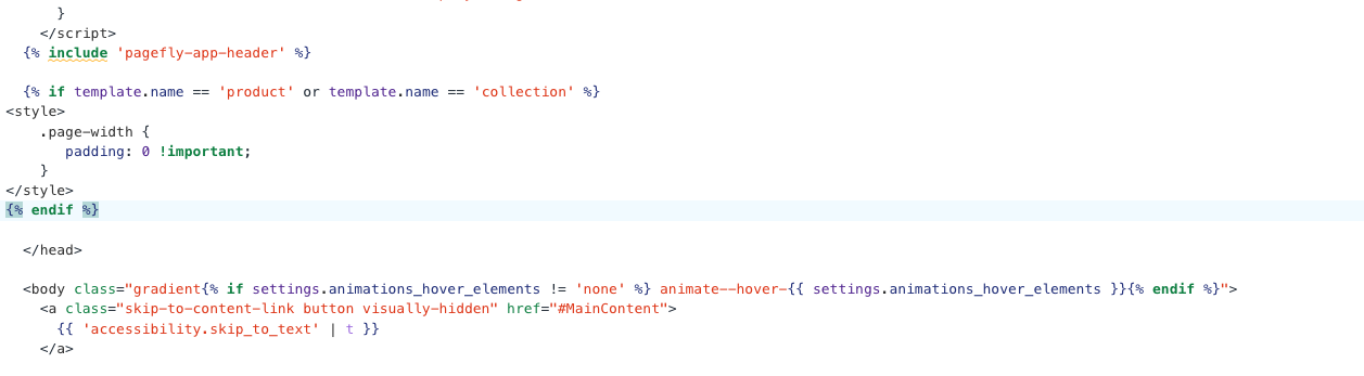
Step 2: Search theme.liquid
{% if template.name == 'product' or template.name == 'collection' %}

{% endif %}
Here is result:
Hope this can help you,
If our suggestions are useful, please let us know by giving it a like or marking it as a solution. Thank you
After adding the CSS, I noticed that the collection will look like this.
The content now appears to be full width of the body. What specific issue are you unsure about? Please let me know, and I’ll help you resolve it.
GASTY
June 16, 2024, 8:24am
6
Thank you. I added the code and it looks like thise. The code is activated now.
GASTY
June 16, 2024, 8:31am
7
Sorry this didnt work. It only messed up the header and announcement bar . I want both collection and product pages to be the same widht as the header and annoncement : full widht. I’ve achieved them by using this css:
.header {max-width: 100%;}
Please try again using the following method.
Step 1. Go to Admin → Online store → Theme > Edit code
Step 2. Find the file base.css. Search the CSS snippet to the end of the file.
@media screen and (min-width: 750px) {
    .page-width {
        padding: 0 5rem;
    }
}
please change to it
@media screen and (min-width: 750px) {
    .page-width {
        padding: 0 20px !important;
        max-width: 100% !important;
    }
    .product-media-container.constrain-height {
        margin-left: 0 !important;
    }
}
GASTY
June 16, 2024, 8:52am
9
Sorry Im confused, what code should I use?
Please remove this code. Consider that you never added this snippet to the theme.
@media screen and(min-width: 750px) {
.page-width{
    padding: 0 !important;
    max-width: 100% !important;
}
.collection.page-width {
    padding: 0 20px !important;
    max-width: 100% !important;
}
}
Just focus on the most recent comment and try following its instructions.
1 Like
GASTY
June 16, 2024, 9:05am
11
Thank you! This worked. Now the header has changed and and I cant edit the top and bottom padding inside the section features. The padding dissapeared and even if I change it doesnt work.
GASTY
June 16, 2024, 9:07am
12
Oh actually now other pages like CONTACT and ABOUT are all messed up. Looks like this is more complicated than what I thought. Ill put it back to how it was before. Thank you anyways!
Oh, I’m sorry about that. I’ll carefully recheck my CSS snippet and provide a solution for you soon. Thank you for your patience.


