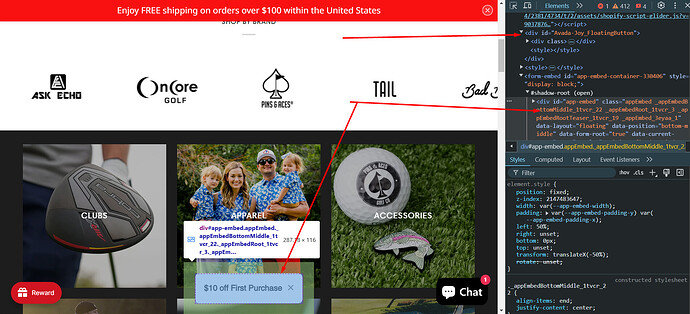
How do I change the size and position of each button? I have chat and rewards and want to add a welcome offer. When I did that the rewards and welcome offer overlapped.
Topic summary
A Shopify store owner is experiencing button overlap issues on mobile devices. Specifically, a “$10 off first purchase” button overlaps with their rewards button when viewed on mobile, though it displays correctly on desktop.
Current Status:
- The button is temporarily disabled for mobile users
- Store URL shared: golfopia.com
Proposed Solutions:
One community member provided CSS code to:
- Reduce heading font size on mobile (max-width: 768px)
- Adjust button positioning using left: 56%
- Target specific classes for the app embed
Another helper identified that while the code exists in desktop view, it’s missing from the mobile version, requesting clarification on where the original code was added.
Discussion remains open as the store owner hasn’t confirmed whether the CSS solution resolved the overlap issue.
Hi @Golfopia ,
Thank you for reaching out to the Shopify community. I’d be glad to assist you. Could you kindly share your store URL and
password (if it’s password-protected) so I can review it and provide you with an update?
@Golfopia - can you please share your website link?
Hi @Golfopia
Please share your store link and take a photo of the button you want to edit
I added a $10 off first purchase button - it looks fine when its viewed on a desktop however on a mobile device the button overlaps with my rewards button. I currently only have the button to show on desktops but would love it for mobile users as well
Hi @Golfopia ,
Go to Online Store, then Theme, and select Edit Code.
Search for base.css/theme.css/style.css/main.css/custom.css file Add the provided code at the end of the file.
@media (max-width: 768px){
h3._teaserHeading_ou4pe_29 {
    font-size: 13px !important;
}

._appEmbedBottomMiddle_1tvcr_22 {
    left: 56% !important;
}
}
Hi @Golfopia
on desktop
i saw your code here
but on mobile, i dont see code
where did you add the code


