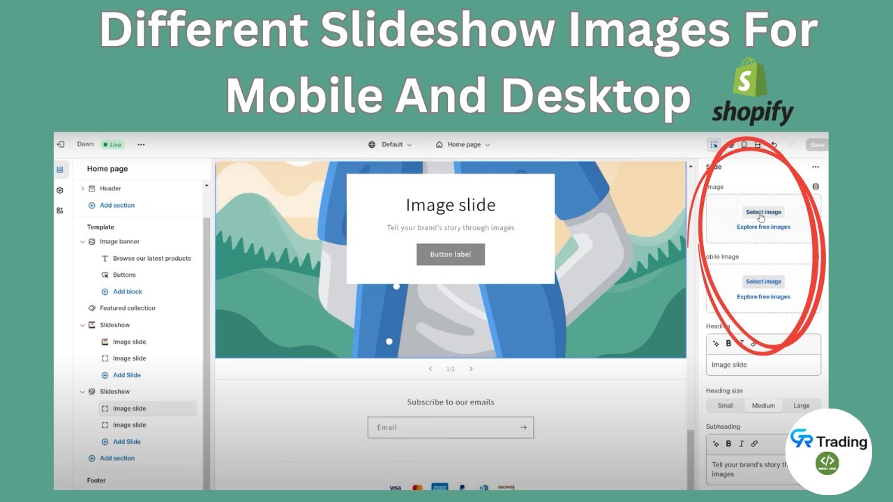
hello, i would like to make it so that i have two separate image banner images, one for mobile and one different one for desktop. How do i do this for horizon theme?
Hi @ads18922 ,
Updating the existing code will be the mess. please refer the video below where we provided the code to add a new section which have the option to add different image for desktop and different for mobile.
Hope this will helps…
Hi @ads18922
Got it ![]() You’re using Horizon theme, and you want a different banner image for desktop vs mobile. Shopify doesn’t allow this by default, but you can easily achieve it with Liquid + CSS media queries inside your section (usually sections/image-banner.liquid).
You’re using Horizon theme, and you want a different banner image for desktop vs mobile. Shopify doesn’t allow this by default, but you can easily achieve it with Liquid + CSS media queries inside your section (usually sections/image-banner.liquid).
Step 1: Add two image pickers in your banner section
In image-banner.liquid, find the schema {% schema %} and add new settings:
{
  "type": "image_picker",
  "id": "desktop_banner",
  "label": "Desktop Banner"
},
{
  "type": "image_picker",
  "id": "mobile_banner",
  "label": "Mobile Banner"
}
Step 2: Output both images in the section
Inside the section code where the banner image is rendered, replace the current image with:
<div class="custom-banner">
  {% if section.settings.desktop_banner %}
    <img
      src="{{ section.settings.desktop_banner | image_url: width: 2000 }}"
      alt="Desktop Banner"
      class="banner-img desktop-only"
      loading="lazy"
    >
  {% endif %}

  {% if section.settings.mobile_banner %}
    <img
      src="{{ section.settings.mobile_banner | image_url: width: 800 }}"
      alt="Mobile Banner"
      class="banner-img mobile-only"
      loading="lazy"
    >
  {% endif %}
</div>
Note: If you’d like my help with your store customization, feel free to contact me at devcodersp@gmail.com
Please like and accept my solution. ![]()
hello, this is a slideshow, not a hero banner
hello @ads18922 i can understand your problems , you need banner section also you need feature separate images mobile and one different one for desktop.
i am Shopify developer like your demand i have crated section and also this in section support your horizon theme
here the section link
Section by link
Here Demo link
password:-Meetanshi a
You can create two hero banner sections, then add the code below to the Custom CSS of each section
- Code for the mobile section
@media (min-width: 750px) {
    .hero { display: none; }
}
- Code for the desktop section
@media (max-width: 749px) {
    .hero { display: none; }
}
Best regards,
Dan from Ryviu: Reviews & QA
@ads18922- there are 2 options,
1 - create separate sections for your desktop and mobile images, this will need editing as mentioned by others or
2] create 2 sections on home page, 1 with desktop image and 2nd with mobile image, make both live and then using css we can show/hide the section you want. This option will need bit of periodic checking as after theme updates id and classes can change, but this one is very easy.

