Hello
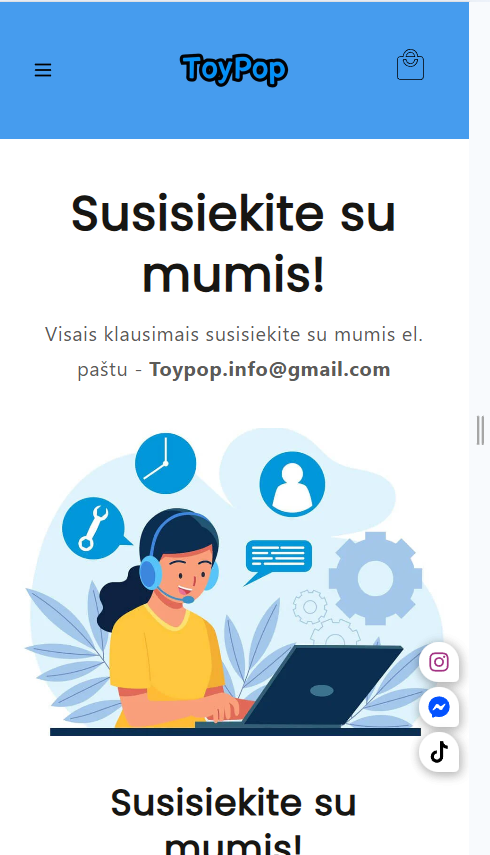
I have a problem I can’t make this photo to show only on desktop I did everything every code but nothing worked
Did one for only mobile but for desktop version nothing seems to work.
please help me out 
Hello
I have a problem I can’t make this photo to show only on desktop I did everything every code but nothing worked
Did one for only mobile but for desktop version nothing seems to work.
please help me out
Hi @Toypop , go to section-image-banner.css and add the following code to the end of it :
@media (max-width:799px){
div#Banner-template--22284692717833__image_banner_GjkxaY .banner__media {
    display: none;
}

}
Hi @Toypop
This may help, You can assign different image on the desktop and the mobile screen.

Please don’t forget to Like and Mark Solution to the post that helped you. Thanks!
Hi,
thanks but unfortunately it is not working
Hello
Thanks but sadly it don’t work and on top of that it only messes with my site
@Toypop , it seems that you have other code that hide the whole section on mobile screen, try to remove this code first and then add my code to only hide the image.
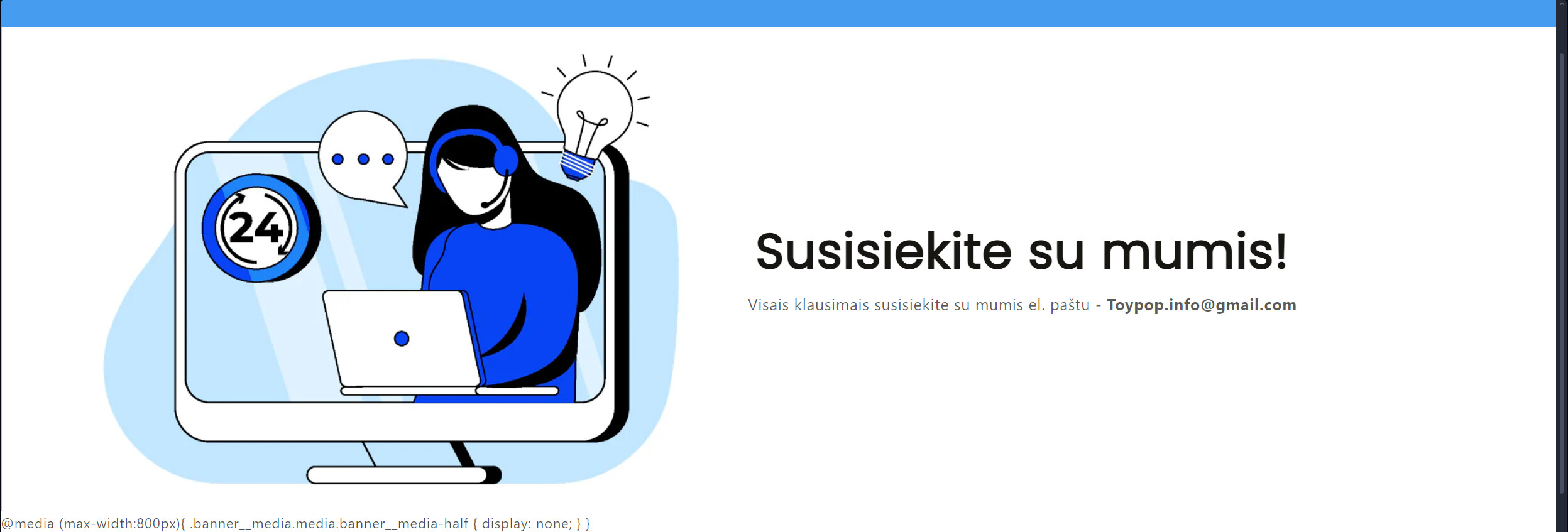
@Toypop , Go to section-image-banner.css and add the following code at the end of it :
@media (max-width:800px){
.banner__media.media.banner__media-half {
    display: none;
}

}
Result:
@Toypop , Where did you put the code?

Here
@Toypop , This is the image-banner.liquid , you should put the code in section-image-banner.css , you can find it in the assets folder of your theme.
@Toypop , Now your image doesn’t show on mobile, it shows only on desktop:
Sorry I confused you a bit i need to leave one section only on desktop and hide it from pc 