Hi!
Im using the Dawn theme and I’m trying to set my products to show in one column on the home page, when viewing on mobile device (vertical).
So the idea is to show a single “list” of products that can be scrolled down and the products are displayed in one column.
Any ideas on how to make this happen?
@projectx
Please share store URL & screenshot what do you want!
Thanks!
@dmwwebartisan
https://jmimportoy.myshopify.com/
password: passw123
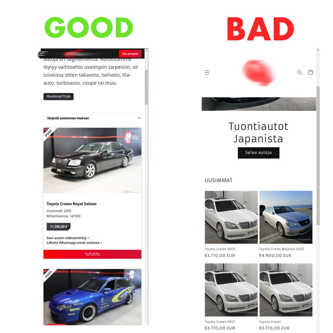
Please see the attachment.
Hey @projectx ,
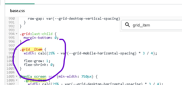
Try the following by pressing edit code in Shopify Admin and navigation to assets → base.css:
- Remove the max width for the .grid__item class at line 929.
Then change the width for the .grid–2-col .grid__item class to calc(100% - 0.5rem / 2) at line 983.
After these changes are done, mobile should just have one column like so:
Hope that helps!
hello @projectx
please Go to Online Store->Theme->Edit code then go to assets/base.css ->paste below code at the bottom of the file.
@media only screen and (max-width: 749px) {
#shopify-section-template--15247916040432__featured_products .grid--2-col .grid__item ,#shopify-section-template--15247916040432__1633955695a7bf4ced .grid--2-col .grid__item {
     width: 100% !important;
     max-width: 100%  !important;
}
}
@archiethedev
please Go to Online Store->Theme->Edit code then go to assets/base.css ->paste below code at the bottom of the file.
@media only screen and (max-width: 749px) {
#shopify-section-template--15247916040432__featured_products .grid--2-col .grid__item ,#shopify-section-template--15247916040432__1633955695a7bf4ced .grid--2-col .grid__item {
     width: 100% !important;
     max-width: 100%  !important;
}
}
Hope this work
Thanks!
Thank you! This works, however the change makes images in collections appear slightly blurry. Would you know by any chance how to fix this? All product photos are around the recommended 2048 x 2048px. On Boundless theme the same product images look sharp and hi-res, regardless of screen size or column changes, so I’m wondering if this is possible with Dawn.
It is working!
But the code that I see in my theme is not exactly the same.
I was thinking does it make some problem in theme
It is not the exact code but still, I change it and worry it may cause some problem