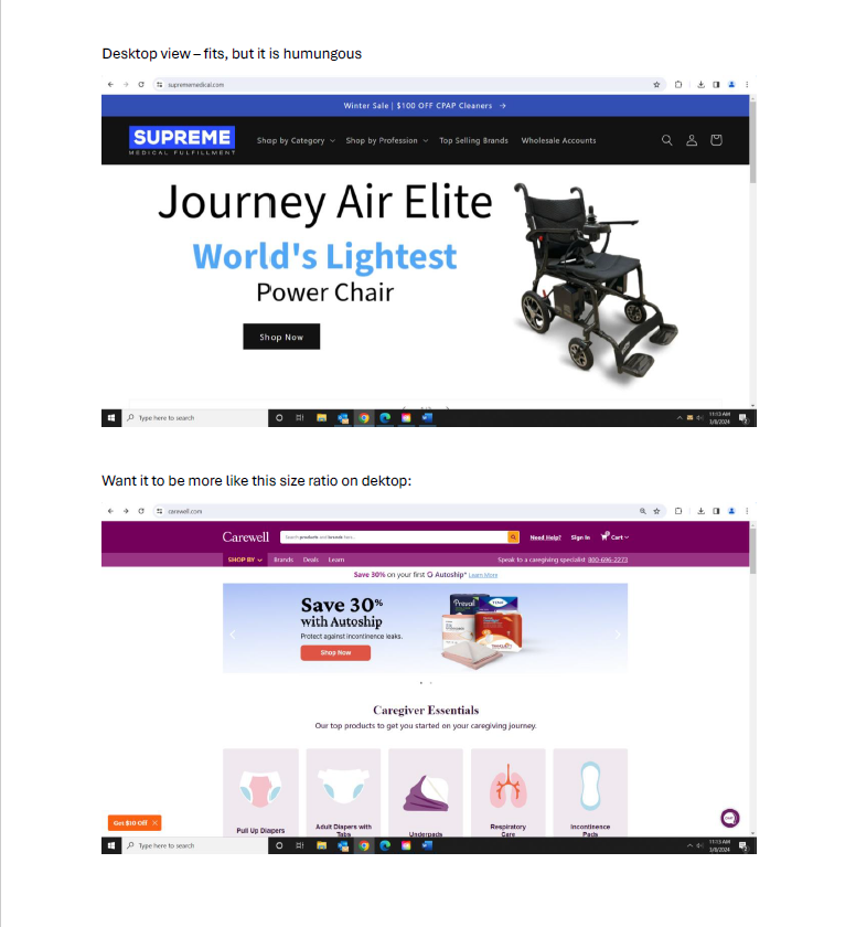
Morning everyone - I am running into an issue when adding a slideshow on our homepage (using dawn theme) It is huge on the desktop view .. so much so that when you go to the homepage, it is all you can see. We want a slideshow there, but want users to still be able to see the shop by category section under it as well. See this website for a good example of what we’re going for www.carewell.com The other issue is the slideshow is not fitting on mobile view at all. I contacted shopify support, they advised me to create the banner in 1200x475 pixels, which I did and changed the setting to adapt to first image. Still no luck. Can anyone recommend what custom CSS code I should drop into this section to accomplish what we want for desktop and mobile view? See images below for the current fit issue on both. Thanks for replies!

update .. I seem to have figured out the mobile view issue. Added this to the section and it fixed that.
@media screen and (max-width: 749px){ .banner__media.media>img {object-fit: fill !important;} .banner__box {padding: 0px !important;} }
Still need a solution to fix desktop slideshow being so large and taking up the whole page … any ideas?
Where did you put this code to have a mobile view?
Same here…it worked for me as well but desktop view is still problematic!!!
click on slidshow-> then scroll down and click on custom css. Add this code there and save. But it fixes mobile view only not desktop view. If u have fixed both Kindly guide me as well. Thanks