Hi,
I’m looking to make some slight changes to the layout of my homepage which uses the Brooklyn theme on mobile.
-
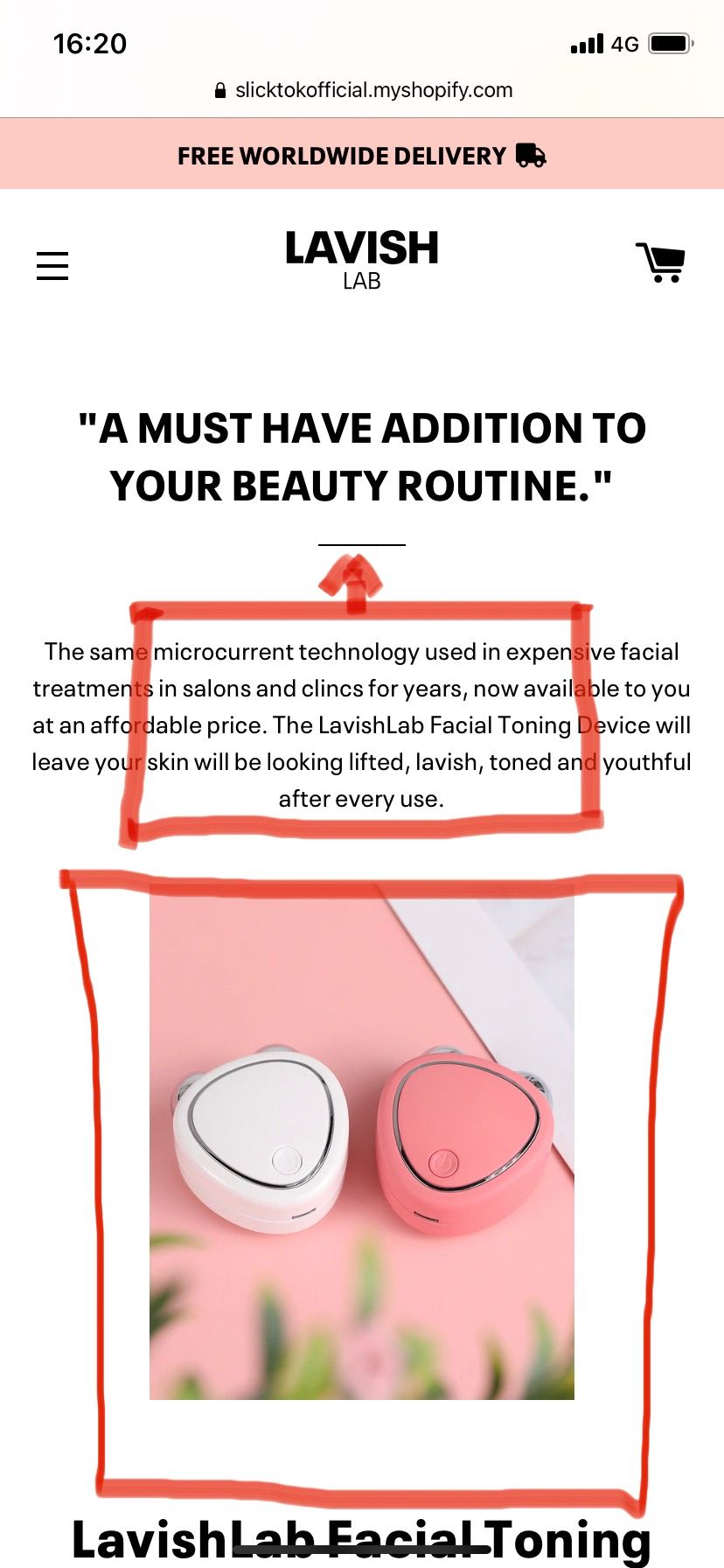
Make body text of ‘Custom HTML’ fit within the red box highlighted on the screenshot below.
-
Remove the line between the header and body text and move body text up closer to header.
-
Enlarge product image on homepage to fit highlighted borders.
I appreciate these are likely quite simple changes to pre-existing code. However, as you can imagine, the coding side of things is not my strong suit!
@SlickTok - these will need CSS settings, can you please share your website link?
Apologies, I’ve just updated the link.
https://lavishlab.co.uk/
@SlickTok - please add this css to the very end of your theme.scss file and check, it is for this section only and should look like screenshot below, you can adjust numbers as per the need.
@media screen and (max-width: 767px){
#shopify-section-16521205438f821bbb .custom__item .rte h2:after{border-bottom: none;}
#shopify-section-16521205438f821bbb .custom__item .rte h2{margin-bottom: 0;}
#shopify-section-16521205438f821bbb .custom__item .rte{max-width: 70%;    margin: 0 auto;}
}

@media screen and (max-width: 590px){
#ProductMediaWrapper-16517012250a5e4269-25366992715935 {max-width: 90% !important;}
}
Amazing! Thank you so much.
Is there any way we could move the product image down slightly so that the margins between other items are the same? See screenshot below.
@SlickTok - please add margin-top:10px to the image wrapper, you can change this number 10 to anything you like… so code becomes
@media screen and (max-width: 590px){
#ProductMediaWrapper-16517012250a5e4269-25366992715935{
max-width: 90%!important;    margin-top: 10px;}
}

