Hello,
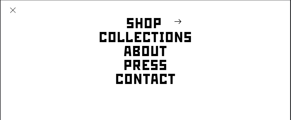
I have a problem with an element in my menu drawer (mobile). It concerns the arrow icon to the right of “SHOP”. I want to set a padding that affects the space between the menu item “SHOP” and the arrow, but I can’t achieve it. This causes the arrow to overlap with the word SHOP or be too far away, depending on the width of the mobile screen. How can I solve this? I am attaching a couple screenshots that show the problem. Thank you in advance!


1 Like
Hi @jensberly ,
You need to put the Media query. So any device that it will renders it will be on the same spot.
1 Like
Hey, thank you for your quick response. I’m kind of new to coding, I don’t know how that could be done – can you help me out if it’s not too much trouble?
1 Like
Yeah, sure would you mind to share your URL website and with password?
You can PM if you dont like to share on public.
Thanks!
I just sent you a PM! 
Thank you for the information. Try this code.
@media only screen and (max-width: 989px) {
    .menu-drawer__menu-item>.icon-arrow {
    position: absolute;
    right: 11rem;
    top: 50%;
    transform: translateY(-50%);
    left: 60%;
}
}
Result:
I hope it help.
hey, I tried but still no luck  here’s a screen recording of how it still looks:
Hi, Its still moving? on another sizes?