Hello,
I’m currently having a bit of an issue with my store, where the design isn’t quite as I want it to he.
Currently, when I enable the mega menu in the header on desktop, it sits a row below the horizontally centered store icon. However, I’d like it to be on the same hight as the icon, split so it’s to the left and right of the icon, basically wrapping around it.
I’d love if someone could help me with adding the necessary theme code so this is possible. 
I’m using the theme Studio Version 10.0.0.
1 Like
Hi @Oliwie0485 ,
Can I give a try? Would you midn to share your URL website? with password if its protected. Thanks!
1 Like
Hey! Thank you for offering help! Unfortunately I’m not able to give you access to the site, since it’s confidential.  Is there any other way you can help me out?
1 Like
Yo uare still new in the studio theme right? this is what you mean?
the icons inline with the nav?
If its like this:
then this is the code.
- From your Shopify admin dashboard, click on “Online Store” and then “Themes”.
- Find the theme that you want to edit and click on “Actions” and then “Edit code”.
- In the “Assets” folder, click on “base.css, style.css or theme.css” file, depending on which file your theme uses to store its CSS styles. At the bottom of the file, add the following CSS code:
- And Save.
.header>.header__search {
        grid-row-start: none;
}
.header__icons {
        grid-row-start: none;
}
I hope it help.
1 Like
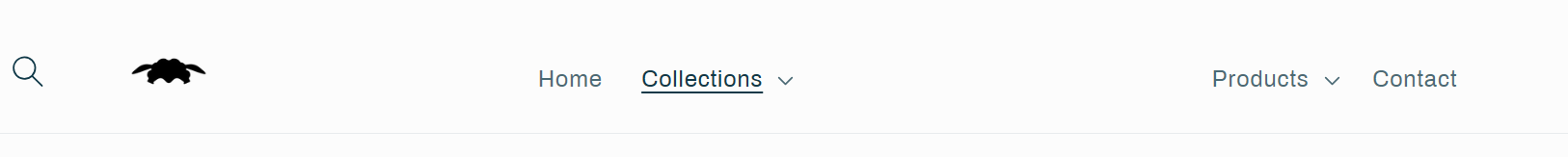
Appreciate the response! I actually meant dropdown menu, not mega menu.  However, I was actually thinking of designing it like this:
Though since I have less items, they should be spaced a bit further apart and closer to the logo.
Where the menu is to the left and right of the icon, all on one level. What would I have to do to make this possible with the studio theme? I only want this on desktop though, so changes shouldn’t have an impact on the collapsible menu on mobile. I’ve got 4 items that should go in this mega menu, two to the left of the logo, and two to the right.
Thanks 
There is 2 option to make it done.
-
Can use the psuedo element but the logo wont be clickable.
-
Need to have write liquid code to add some container to separate the Menu.
1 Like
I’d be totally fine with either option, as long as it doesn’t impact the mobile hamburger menu drop-down. 
Would you mind guiding me? Which one is easier to do?
1 Like
I come up with this solution. But is only for the Desktop view.
Codes.
@media only screen and (min-width: 990px){
header.header.header--top-center.page-width.header--has-menu {
    display: flex;
    justify-content: space-between;
    align-items: center;
}
nav.header__inline-menu ul {
    list-style: none;
    margin: 0;
    padding: 0;
    display: flex;
}
nav.header__inline-menu li:nth-child(3) {
    margin-right: 100px;
}
h1.header__heading {
    position: absolute;
    left: 43%;
}
nav.header__inline-menu li:nth-child(4) {
    margin-left: 130px;
}
}
1 Like
That seems pretty good, but unfortunately, I ran into some issues.
This is how it looks when I copy your code into the base.css:
And it seems to break dropdowns as well:
Do you have suggestions on how to fix these?
I really appreciate your help so far!
1 Like
Here’s a better illustration of how I’d like it to be:
That selector is base on the demo theme in shopify. As you said you cant share your URL website since its confidential. So what Im doing here are just guessing .
1 Like
Yes, sorry! I don’t want to bother you with this too much. I only have four items in the menu, instead of the 6 in the demo.
Could you make this work? I’ll happily tip you something if you can figure this out. Are the dropdowns working in the demo with the adjustments?
1 Like
Yes, we can make some adjustment, If its only four. And also Im not changing the drop down menu only the position of the header. The solution im giving is not the exact one. Its really hard to determind which selector I need to used when Im not seeing the actual design that will work on. If you dont like to share in public the store website. You can Pm me.
1 Like
- From your Shopify admin dashboard, click on “Online Store” and then “Themes”.
- Find the theme that you want to edit and click on “Actions” and then “Edit code”.
- In the “Assets” folder, click on “base.css, style.css or theme.css” file, depending on which file your theme uses to store its CSS styles. At the bottom of the file, add the following CSS code:
- And Save.
@media only screen and (min-width: 990px){
header.header.header--top-center.header--mobile-center.page-width.header--has-menu.header--has-social {
    display: flex;
    justify-content: space-evenly;
}
nav.header__inline-menu li:nth-child(3) {
    padding-left: 250px;
}
h1.header__heading {
    position:absolute;
}
details-modal.header__search, {
    flex: 1;
    display: flex;
    justify-content: center;
}
nav.header__inline-menu  {
    flex: 3;
    text-align: center;
}
}
I hope it help.
1 Like
Looks much better! But still breaks the dropdown
It’s always the third item in the dropdown list which gets pushed to the right.
And for some reason, going to a different page other than home, pushes the icon to the left side:
1 Like
I come up with other solution again.
@media only screen and (min-width: 990px){
header.header.header--top-center.header--mobile-center.page-width.header--has-menu.header--has-social {
    display: flex;
    justify-content: space-evenly;
}
summary#HeaderMenu-products:before {
    content: "";
    padding-right: 250px;
}
h1.header__heading {
    position:absolute;
}
details-modal.header__search, {
    flex: 1;
    display: flex;
    justify-content: center;
}
nav.header__inline-menu  {
    flex: 3;
    text-align: center;
}
}
Check it and let me know. Maybe I can think another solution again. 
1 Like
Hey,
It fixes the issue with the drop-down menu, but unfortunately the logo still gets pushed to the left when on another page. So only on “Home” it’s centered.
1 Like
Can you insert !important on this code.
h1.header__heading {
    position: absolute !important;
}
Let see if still moving. In my end I cant see the other pages. Only the page I edit, Cause it will gone everytime the website refresh.
1 Like


