I am trying to make my announcement bar sticky. However if I apply the following code:
div#shopify-section-sections–21580379259203__announcement-bar {
position: sticky !important;
top: 0;
}
It covers half of the header as well.
Anyone knows what I can do in this instance?
Topic summary
A user working with Shopify’s Sense theme encountered an issue where applying position: sticky to the announcement bar caused it to overlap the header.
Desktop Solution:
- Add CSS to push the header down by the announcement bar’s height:
.shopify-section-header-sticky.scrolled-past-header {
  top: 40px !important;
}
- Insert into
base.cssfile under Assets - Adjust the pixel value (40px) to match announcement bar height
Mobile Solution:
- Use media query to adjust positioning:
@media screen and (max-width: 767px) {
  #shopify-section-sections--21580379259203__announcement-bar {
    position: sticky !important;
    top: 0 !important;
  }
  .section-header.shopify-section-group-header-group {
    top: 78px !important;
  }
}
Additional Issues Resolved:
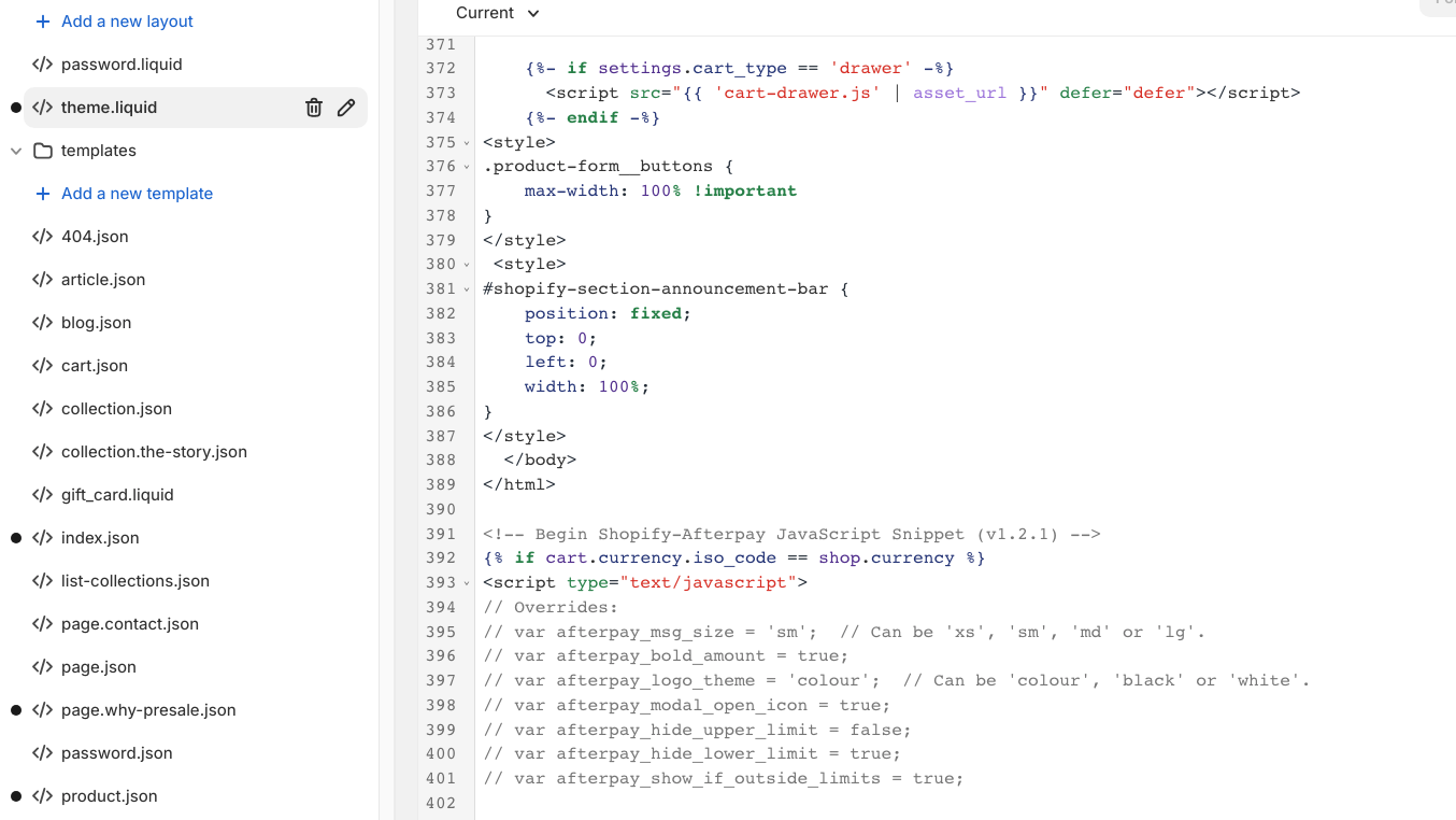
- A second user (Lydia224) successfully implemented the solution using
<style>tags intheme.liquidbefore the</body>tag - Fixed a small gap between announcement bar and header on desktop by reducing the top value by 1px
The discussion remains open with a follow-up request about adding payment provider icons to the announcement bar.

Which theme are you using?
please add a margin top with the same height of the top bar like if your top bar is 50px then you need to give top-margin of the logo section like, margin-top:50px;
it will be very easy for me to share an exact code for you if you could provide me store url.
Thanks
Thanks for your quick reply! My store url is: https://sensorpro.nl/
please add below code into your css file where you already place the code.
Online Theme > Edit Code > Assets > base.css file.
.shopify-section-header-sticky.scrolled-past-header {
	top: 40px !important;
}
That worked thanks! The only thing is that it is not working for mobile. Is there a way to fix this for mobile as well?
1 Like
Ok let me share it
It is because your top bar is not sticky on mobile
Okay! How can I change this?
use below code for mobile
@media screen and (max-width: 767px) {
.shopify-section-header-sticky.scrolled-past-header {
	top: 78px !important;
}
}
Thanks
Hello!
Thanks again for your incredible help. I added this code, however, it works on my shopify theme, but not on my regular mobile phone. Is there something else I can try?
Did you added this code i provided in the theme because i am not able to see that.
Yes I did!
replace the above code which i sent second time with this.
@media screen and (max-width: 767px) {
#shopify-section-sections--21580379259203__announcement-bar {
	position: sticky !important;
	top: 0 !important;
}
.section-header.shopify-section-group-header-group {
	top: 78px !important;
}

}
It still does not work unfortunately
It is strange for me
Hey, @JesperW
I’m not formally trained in code to provide you with an exact solution to code a sticky announcement. However, I’m confident one of our Shopify experts would be able to accomplish this at a reasonable price.
Just wanted to share this as an option in case you are unable to find a coding solution in your thread.
Hi, below what previous code should I insert your code to make the announcement bar sticky please?
I’m using ‘Sense’ theme.
Thanks