Hello everyone!
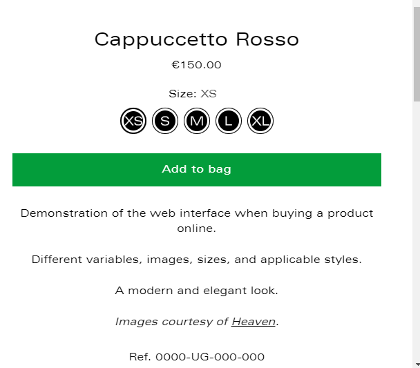
I was wondering if anyone knows how to center everything on my product pages? (title, price, shop pay, buttons, description…) both on the mobile and on the computer (on the computer the content would remain to the right of the photos, but centered in its own block). I am on the Stiletto theme. I have looked for codes in various forums but none work! Thanks in advance!
1 Like
Hi @martujv
Would you mind to share your Store URL website? with password if its protected. Thanks!
Thank you for the information. Try this one.
- From your Shopify admin dashboard, click on “Online Store” and then “Themes”.
- Find the theme that you want to edit and click on “Actions” and then “Edit code”.
- In the “Assets” folder, click on “base.css, style.css or theme.css” file, depending on which file your theme uses to store its CSS styles. At the bottom of the file, add the following CSS code:
- And Save.
.product__details.product__primary-right * {
    text-align: center;
}
.product__price-and-ratings {
    justify-content: center;
}
.product__controls-group.product__variants-wrapper.product__block.product__block--medium {
    display: flex;
    justify-content: center;
}
.product__label-wrapper {
    justify-content: center;
}
Result:
"  Your Feedback Matters! Please mark the solution and give likes to posts that helped you. Your appreciation fuels our motivation to assist you better!
  "
"
1 Like
And for this part? (the box)
Im about to ask you that, I forgot. 
Try this.
Same Instruction.
.product__callouts-item.fs-body-75 {
    justify-content: center;
}
Result:
" Your Feedback Matters! Please mark the solution and give likes to posts that helped you. Your appreciation fuels our motivation to assist you better! "
1 Like
It works! One last thing to close the thread: how could the main menu and the footer be centered? (only in the mobile version) Thank you so much again!
1 Like
Do you mean all the text in the footer?
Try this one.
- From your Shopify admin dashboard, click on “Online Store” and then “Themes”.
- Find the theme that you want to edit and click on “Actions” and then “Edit code”.
- In the “Assets” folder, click on “base.css, style.css or theme.css” file, depending on which file your theme uses to store its CSS styles. At the bottom of the file, add the following CSS code:
- And Save.
@media only screen and (max-width: 959px){
.footer__groups {
   text-align: center;
}
.footer__bottom {
    text-align: center;
}
form#localization_form {
    display: flex;
    justify-content: center;
}
.footer__bottom-right {
    justify-content: center;
}
}
Result:
" Your Feedback Matters! Please mark the solution and give likes to posts that helped you. Your appreciation fuels our motivation to assist you better! "
1 Like
It works! And for the mobile’s main menu? That’s the last thing I need!
1 Like
Try this one same Instruction.
@media only screen and (max-width: 959px){
.drawer-menu__all-links {
    align-items: center;
}
a.drawer-menu__link {
    justify-content: center;
}
}
Result:
I hope it help.
" Your Feedback Matters! Please mark the solution and give likes to posts that helped you. Your appreciation fuels our motivation to assist you better! "
1 Like


