Hello!
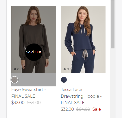
I want to add a Sold Out label & overlay to sold out items on the website. I tried a code (pasted below) that I found in a different discussion but the overlay didn’t cover the entire product photo.
The website is - www.thrivesociete.com
.product-block .product-link {
    position: static;
}
.product-block .price-label--sold-out {
    position: absolute;
    left: 0;
    top: 0;
    right: 0;
    bottom: 7.5%;
    width: 100%;
    padding-top: 100%;
    margin: 0;
    color: transparent;
}
.product-block .price-label--sold-out:before {
    content: "Sold Out";
    position: absolute;
    top: 50%;
    left: 50%;
    transform: translate(-50%, -50%);
    width: 90px;
    height: 90px;
    line-height: 90px;
    background: #000000;
    color: #fff;
    text-align: center;
    border-radius: 50%;
    z-index: 1;
}
.product-block .price-label--sold-out:after {
    content: "";
    background: #000;
    opacity: 0.1;
    width: 100%;
    padding-top: 100%;
    left: 0;
    top: 0;
    right: 0;
    bottom: 7.5%;
    position: absolute;
}
@media screen and (max-width: 749px) {
.product-block .price-label--sold-out:before {
    height: 60px;
    width: 60px;
    line-height: 60px;
    font-size: 12px;
Hi @ModStageApparel
This is Victor from PageFly - Shopify Page Builder App
Please add this code to your theme.liquid above the to get this solved
Step 1: Online Stores > Themes > More Actions > Edit code
Step 2: click on theme.liquid and paste the code above the
.product-block .product-link {
    position: static;
}
.product-block .price-label--sold-out {
    position: absolute;
    left: 0;
    top: 0;
    right: 0;
    bottom: 7.5%;
    width: 100%;
    padding-top: 100%;
    margin: 0;
    color: transparent;
}
.product-block .price-label--sold-out:before {
    content: "Sold Out";
    position: absolute;
    top: 50%;
    left: 50%;
    transform: translate(-50%, -50%);
    width: 90px;
    height: 90px;
    line-height: 90px;
    background: #000000;
    color: #fff;
    text-align: center;
    border-radius: 50%;
    z-index: 1;
}
.product-block .price-label--sold-out:after {
   content: "";
    background: #000;
    opacity: 0.35;
    width: 100%;
    left: 0;
    top: 0;
    right: 0;
    bottom: 13%;
    position: absolute;
}
@media screen and (max-width: 749px) {
.product-block .price-label--sold-out:before {
    height: 60px;
    width: 60px;
    line-height: 60px;
    font-size: 12px;
Hope this can help you solve the issue
Best regards,
Victor | PageFly
Hi @ModStageApparel ,
Glad to support you today.
You can check out my suggestion below to get your concern resolved:
- Go to Edit code on Online Store:
- add my code above the tag on Theme.liquid:
Eg:
Hope you find my answer helpful!
Kind & Best regards,
GemPages Support Team.
Hi @GemPages ,
For web, the overlay doesn’t cover the full image
For mobile, the overlay goes way past the image.
Any suggestions?
Thanks!
Hi @PageFly-Victor ! This code didn’t work. I think the placement may be wrong as it showed on top of the announcement banner but made no change to the product images.
Thanks!
Hi @ModStageApparel
Please help me add this code again and notify me when you added it, because seems like the issue is because of different screensize :
Once you added the code, i can check on it directly.
Thank you