Turn collapsible content from rows into columns

Hi Hi!

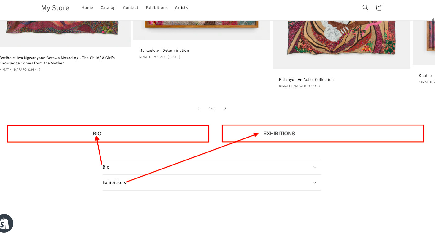
I would like to change my current collapsible content from rows into columns- see an example of what I would like it to look like below. Does anyone know if that is possible?

SITE: https://e1c8d3.myshopify.com/collections/kimathi-mafafo-1985

PASSWORD: thaits

Thanks for the help in advance!

Hi @Bird_on_a_Wire ,

We need to create a new section and create 2 columns with accordion in that.

Hi @Bird_on_a_Wire

If you switch to columns, it will look like this:

Do you still want to change? Please let us know if you need further help.

Hi @BSS-Commerce and @SmallTask

Happy with either of these options- could you guide me through how to do it?

Thanks

Hi @Bird_on_a_Wire

Please follow these steps:

  1. From Shopify admin → Online store → Edit code:
![view - 2023-02-10T160636.301.png|1891x940](upload://gnqBIzcqycLi7gAB4coGQZQWUqr.png)
  1. You find the file base.css and add the following code at the end of the file:
@media screen and (min-width: 750px) {
  .collapsible-section-layout .section-template--17949210149168__fd8aeb2a-be0b-4abf-b51b-7cacd8d5b34b-padding .grid__item {
  display: flex;
  flex-wrap: wrap;
}

.collapsible-section-layout .section-template--17949210149168__fd8aeb2a-be0b-4abf-b51b-7cacd8d5b34b-padding .grid__item .accordion {
  width: 33.33%;
  box-sizing: border-box;
  padding: 10px;
}

.collapsible-section-layout .section-template--17949210149168__fd8aeb2a-be0b-4abf-b51b-7cacd8d5b34b-padding .collapsible-content-wrapper-narrow {
  max-width: 100% !important;
}

.collapsible-section-layout .section-template--17949210149168__fd8aeb2a-be0b-4abf-b51b-7cacd8d5b34b-padding .accordion {
  border-top: 0.1rem solid rgba(var(--color-foreground),.08) !important;
}
}

This code will only apply to screens larger than 750px (not mobile) because mobile with 3 columns will be very bad.

If you want to adjust to 2 columns, just change width: 33.33% to width: 50%

If you want to apply to both mobile and PC, remove this code:

@media screen and (min-width: 750px) { }

I hope that this will work for you.

Thank you @BSS-Commerce that’s worked perfectly!

1 Like

Hello pls, on my store how can i see it ? what do i have to add ? thank you

Hi @victorchtb
Can you kindly share your store link (with the password, if any) with us?

It’s better if you have a post and share the details of your problem (screenshot/ record) and tag us. So that we can check it easily and suggest you a solution if possible.

Hello,

I am looking for a similar web page design for my products on my Shopify website. I want to create a page where I can have the product names in specific category (title), I want the products which are in collapsible row to be converted into 2 columns which would be mobile friendly as well. I am attaching ss of the page I am talking about, the bulk products page. (I am going to add the details in collapsible rows later on, a line or two)

Website: https://adinathchemicals.myshopify.com/

Pwd: etwaud

Would be really grateful for your help.