Hello all,
This is my first post on this forum because I have an urgent problem with a Shopify store using the Motion theme.
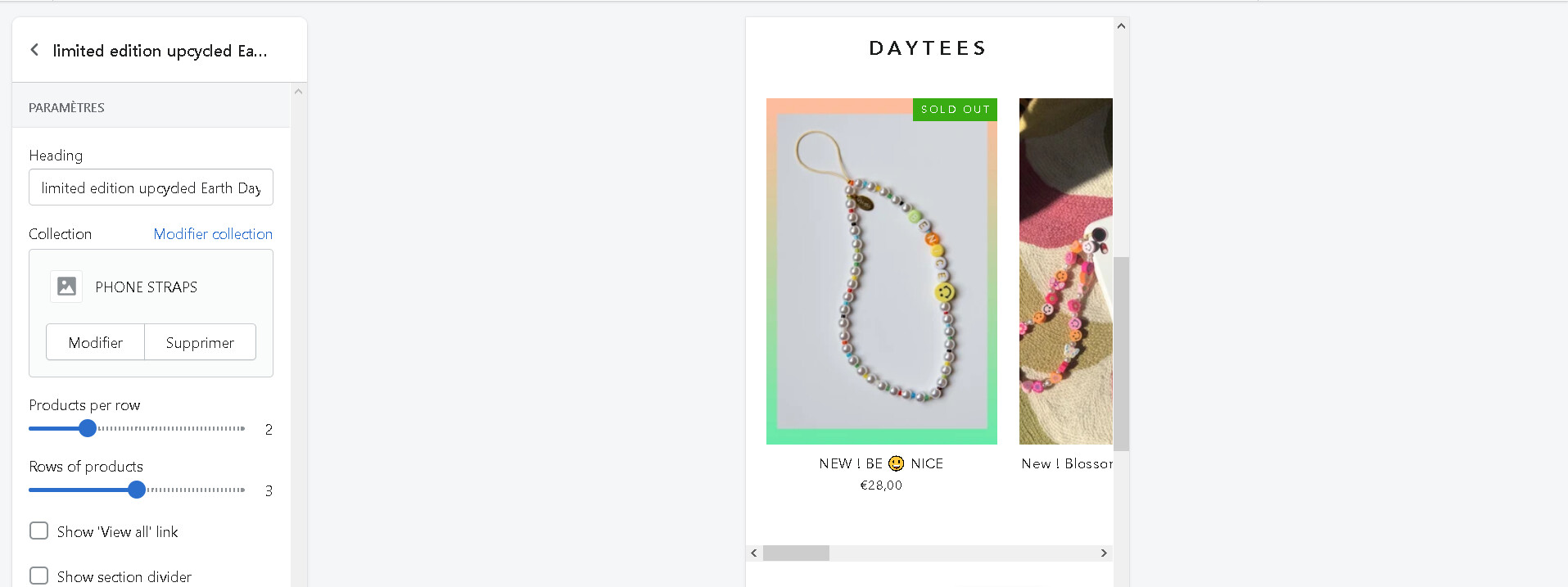
I want to add a Featured Collection on my home page with 2 products per line and 3 product lines. As on this site: https://www.eliou-eliou.com/
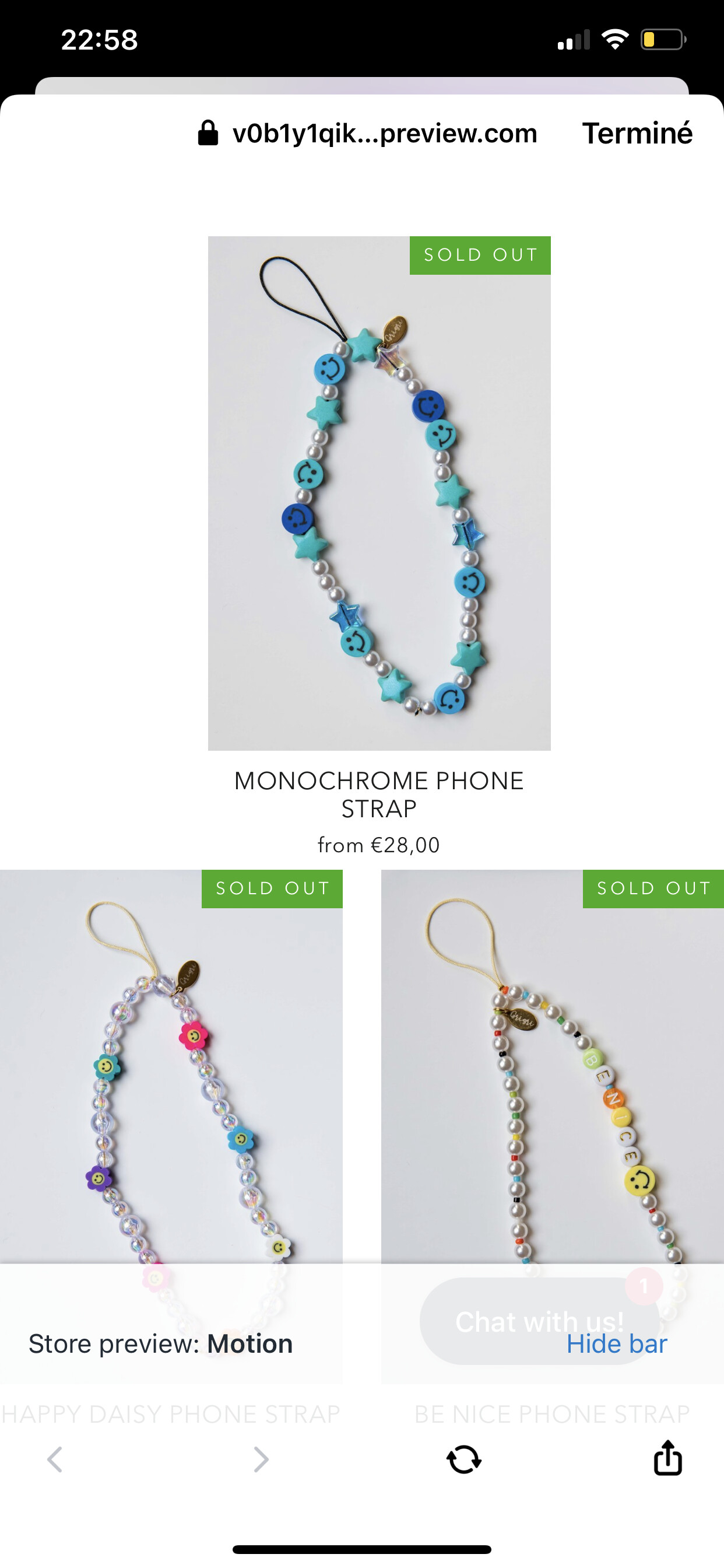
When I add the “Featured collection” Section, the layout is perfect on computer, but on mobile, it looks like a “switcher” or “slider” form, and it doesn’t suit me at all …
Like on the site I sent you, I would like to have 2 products per line on mobile and keep this layout on my desktop.
The strangest thing is that on my Collection Page on Mobile, I have 2 products per line and it’s perfect. But this change should only apply to the home page.
I tried a lot of things but can’t find any solution … you would save me if you could help me ..!
Here is a preview link of my site which is not yet live : https://v0b1y1qikmo74hph-47455862950.shopifypreview.com
Thank you in advance…
Max C.
1 Like
Thanks a lot for your answer. No not really, this is what I have:
So I don’t understand why you have 3 products …
Then here’s what it does to me on mobile:
While I would like this …:
1 Like
Oh you probably have 3 products because you must be on the collection page. My problem concerns the home page.
Thanks in advance to all…
Really sorry to reiterate but please someone already had this problem? This is very important to me … Thanks in advance for your help
@MaxCosta
can you please confirm this?
1 Like
Thank you for your reply @KetanKumar
no,but the photo you just sent me is what I would like to have on my homepage
I have that: (this is a slider)
@KetanKumar @This is what I want !
1 Like
@MaxCosta
thanks for confirm please add this code
- Go to Online Store->Theme->Edit code
- Asset->/theme.css ->paste below code at the bottom of the file.
this code apply for after 5 - 6 second
@media only screen and (max-width: 589px) {
#shopify-section-16193798554af94825 .grid-overflow-wrapper {
    overflow: visible;
    overflow-x: visible;
}
#shopify-section-16193798554af94825 .grid-overflow-wrapper .grid {
    white-space: nowrap;
    display: flex;
    flex-wrap: wrap;
    justify-content: center;
}
#shopify-section-16193798554af94825 .grid-overflow-wrapper .grid__item {
width: 50%;
    flex: 0 0 50%;
}
}
2 Likes
it’s much better but it does this to me:
In addition, would it be possible to create a small space (margin) at the edges of the screen? like this :
 ty
ty
@KetanKumar @Like this without slider:
thank you in advance
1 Like
@MaxCosta
yes please add this code
@media only screen and (max-width: 589px) {
#shopify-section-16193798554af94825 .grid-overflow-wrapper .grid__item:first-child {
    margin-left: 0;
}
}
after code view
1 Like
@MaxCosta
it’s my pleasure to help us
1 Like
Im so sorry @KetanKumar but I have a problem with your solution
mobile rendering is this one :
but i want this one :
can you create this spacing? and margins on the sides? you would save me
Thank you in advance @KetanKumar
My website : https://v0b1y1qikmo74hph-47455862950.shopifypreview.com
1 Like
@MaxCosta
thanks for your feedback yes, please add this code
@media only screen and (max-width: 589px) {
#CollectionSection-16193798554af94825 .page-width--flush-small {
    padding: 0 15px;
}
}
1 Like
@KetanKumar how to thank you… you’re the best bro thanks a lot
1 Like
@MaxCosta
it’s my pleasure to help us
1 Like
Hello,
@KetanKumar I’m sorry to come back to you but I think you can help me.
Still on the same site, I activated the colors swatches on my Featured Collection of Home Page.
I would like to :
-
center the choice of colors
-
slightly increase the spacing between lines? (because the colors swatches is very close to the bottom line)
-
possibly slightly reduce the size of the product and price titles (for a balanced rendering)
-
and above all to have colored circles instead of squares.
Do you think this is something that is achievable for you? I’m really sorry but it’s manipulations that I’m not used to doing at all … it allows me to learn at the same time
If it’s too complicated for you, I would understand.
Thank you in advance,
Max
1 Like
@MaxCosta
Thanks for it
yes, sure i will help i have share code soon
1 Like